Medium is a poor choice for blogging
THIS ARTICLE IS BEST CONSUMED ON MEDIUM.
Many people choose Medium lately as their go-to platform to blog. Kind of like Blogger a while back, it just seems what everybody has been doing (unless you are really nit-picky and care enough to host your own thing).
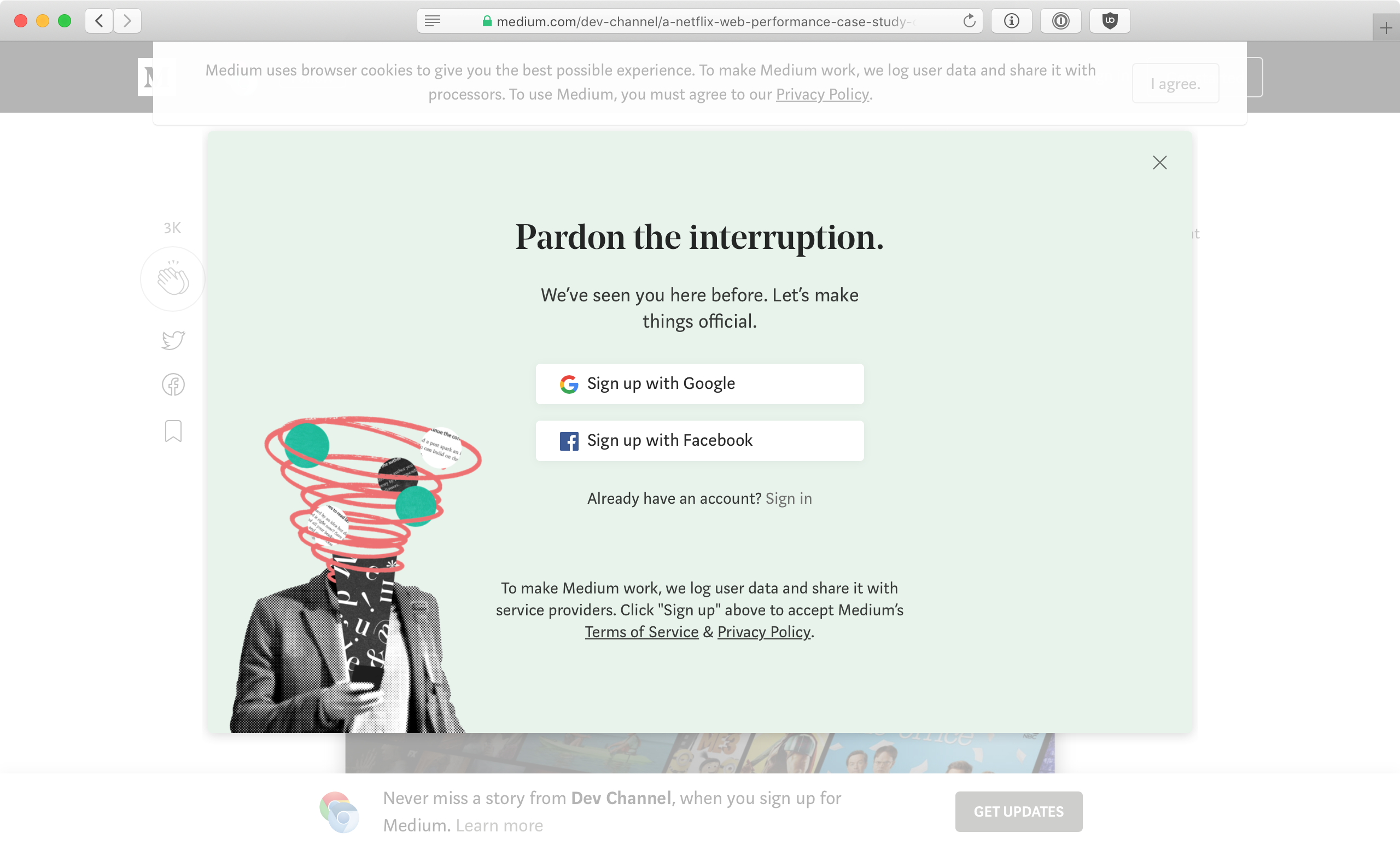
And kind of like Blogger, Medium is a terrible thing for publishing. If you think about publishing an article, starting a blog or even just sharing a short rant on Medium, please consider what you’ll be putting your readers through.
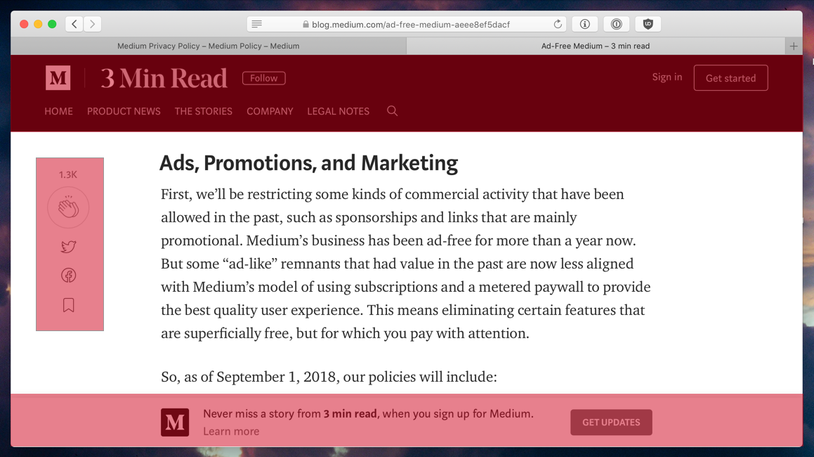
Every Medium article will greet each person who opens your link with a huge full-page banner every time:
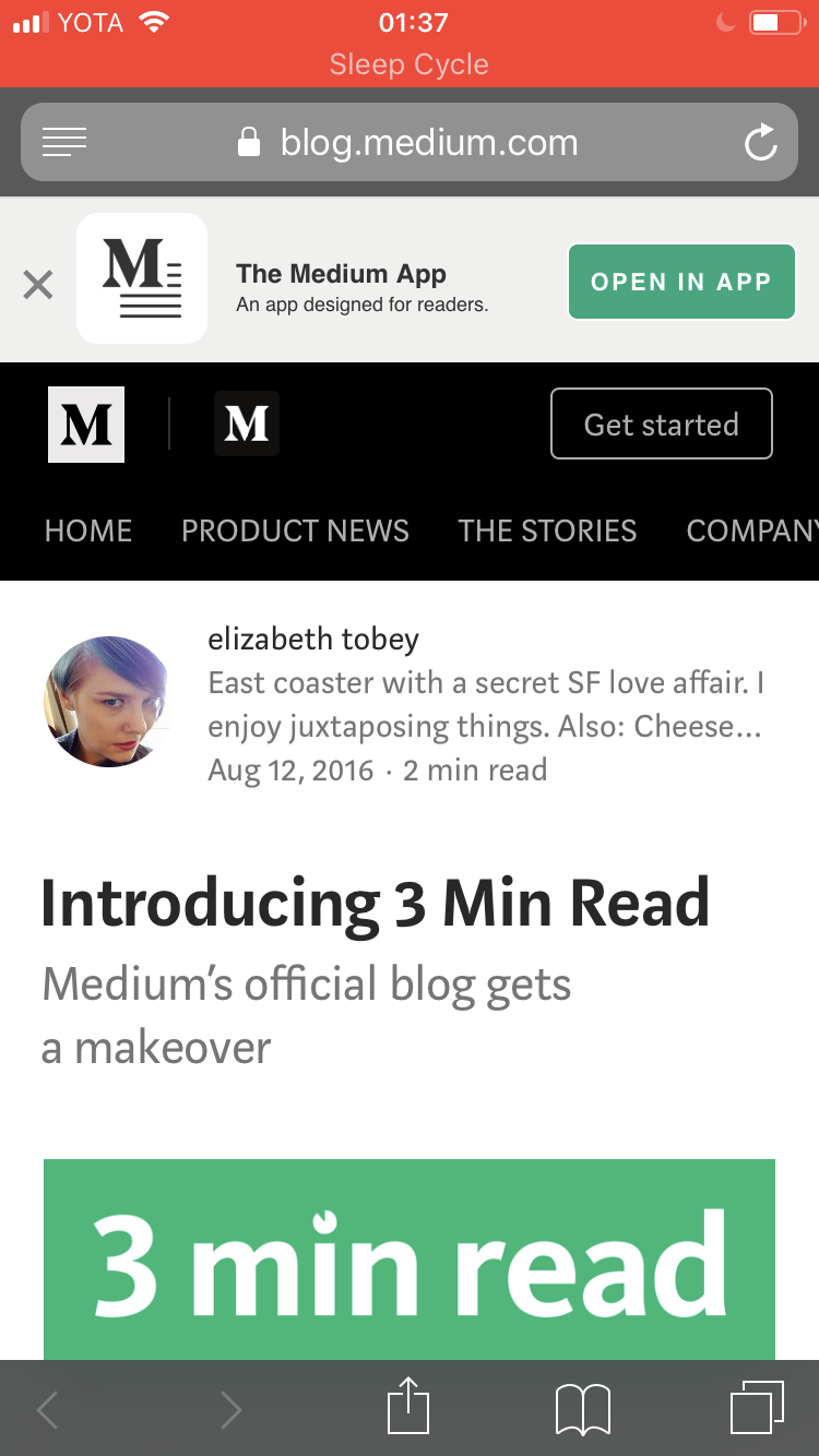
If they open your link on a phone, Medium will really, really, really insist on installing an app. I guess reading text from a webpage is too old-school:
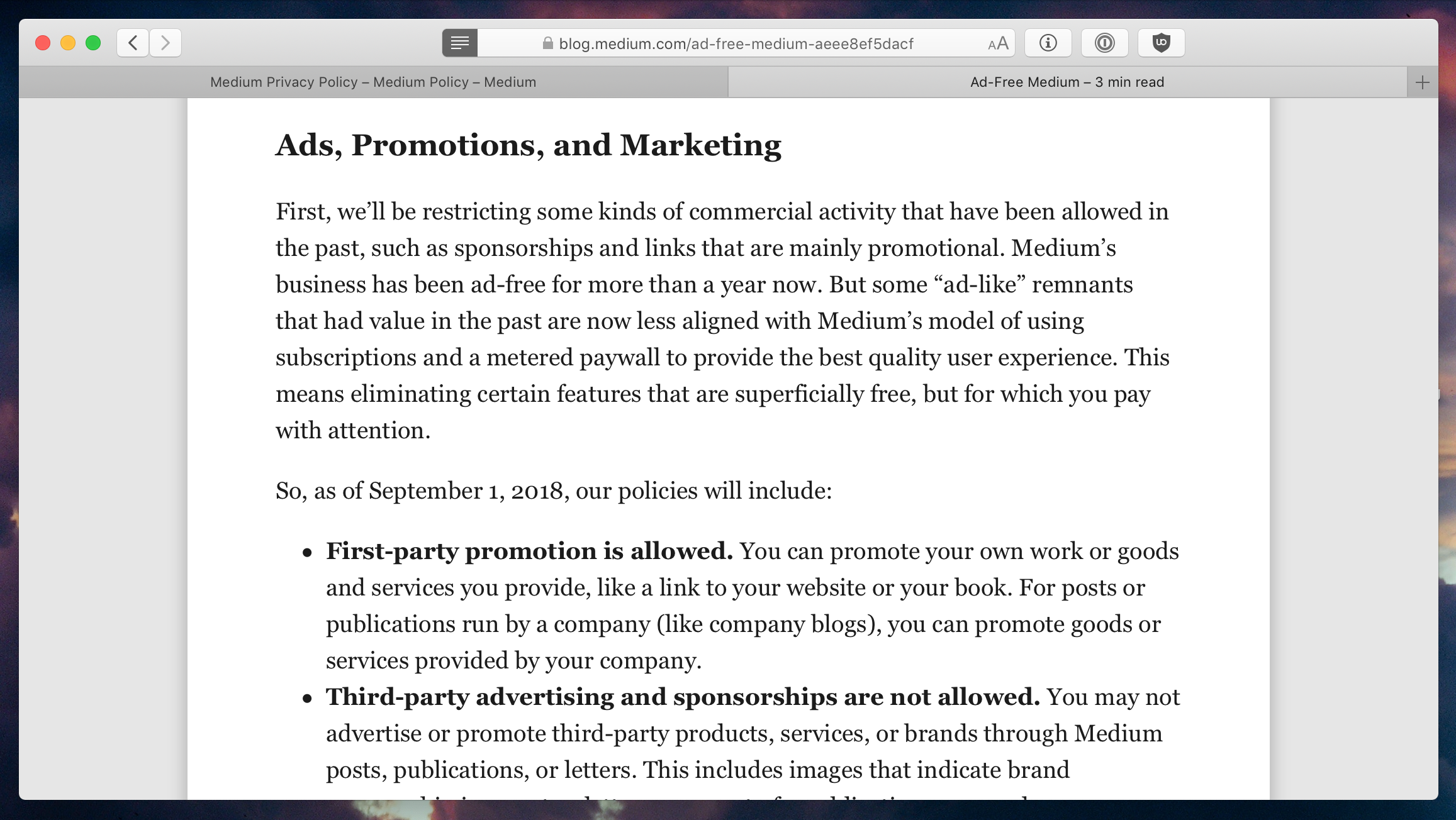
Medium is advertising itself as a reader-oriented experience. At the same time, most of Medium articles look and read worse than just plaintext HTML. If you get through banners and set down to read anything, you will be surrounded by HUGE sticky header, sticky footer and sticky social media controls:
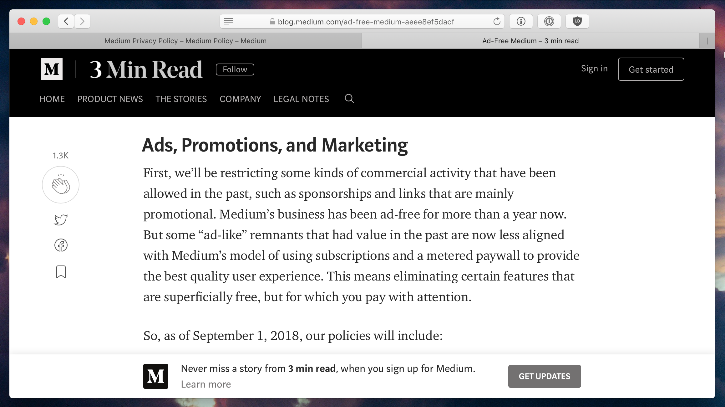
No, those do not go away as you scroll. They literally (yes, literally) take up 25% of your vertical space (and vertical space is very valuable, especially for text columns and horizontal screens):
For contrast, this is how it could’ve look like without Medium styling: nice and pleasant to read.
I mean, you don’t have to do anything special with text, it was designed to look fine by default. You had one job: don’t mess it up.
Every time you select text an annoying popup shows up. And if you accidentally click it (which is really easy to do because it pops up right under your cursor) you’ll be redirected to the login page (and lose your reading position) because God forbids unauthenticated users would try to do anything with their platform.
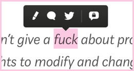
So scroll, but do not touch. In spite of the fact that it’s a plain freaking text.
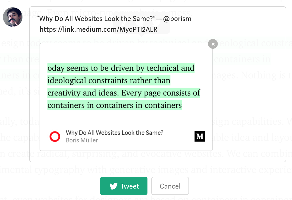
But maybe that popup is useful? I don’t know. Take me, for example. I’m perfectly capable of posting links and quotes on Twitter without any popup menus (and without converting them into an image first). In fact, popup menu makes it harder for me because I can’t safely select text and adjust selection anymore.
And yes, it does attach an image of you selecting a text on Medium instead of just quoting the text. What a mess.
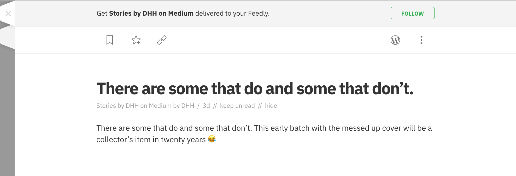
But the misadventures do not end here. If anyone decides to blog on Medium regularly, there’s no way to follow them through RSS. I mean Medium does serve RSS, but they serve it with replies and it turns the whole idea into a non-usable mess. You just get random phrases with no context in your feed instead of articles:
You can always follow people on Medium, you would say. Sort of, but Medium does not have a non-algorithmic (linear, that is) feed. Look at this mess:
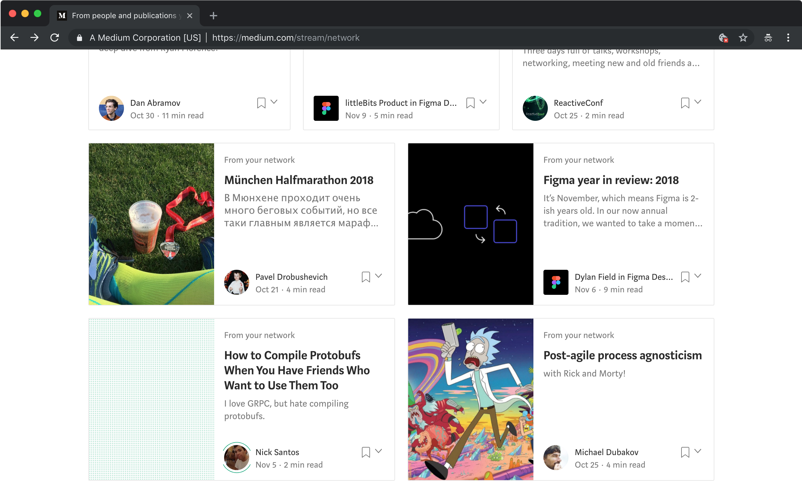
Look how dates are all over the place. What happened here? And I only get to access the 15 latest publications? At least I hope they are latest.
Another interesting point is that they are really eager to block embeds that do not respect Do Not Track header but do not respect DNT themselves. Yes, Medium will collect your profile even if you are not a registered user and explicitly ask them not to do it.
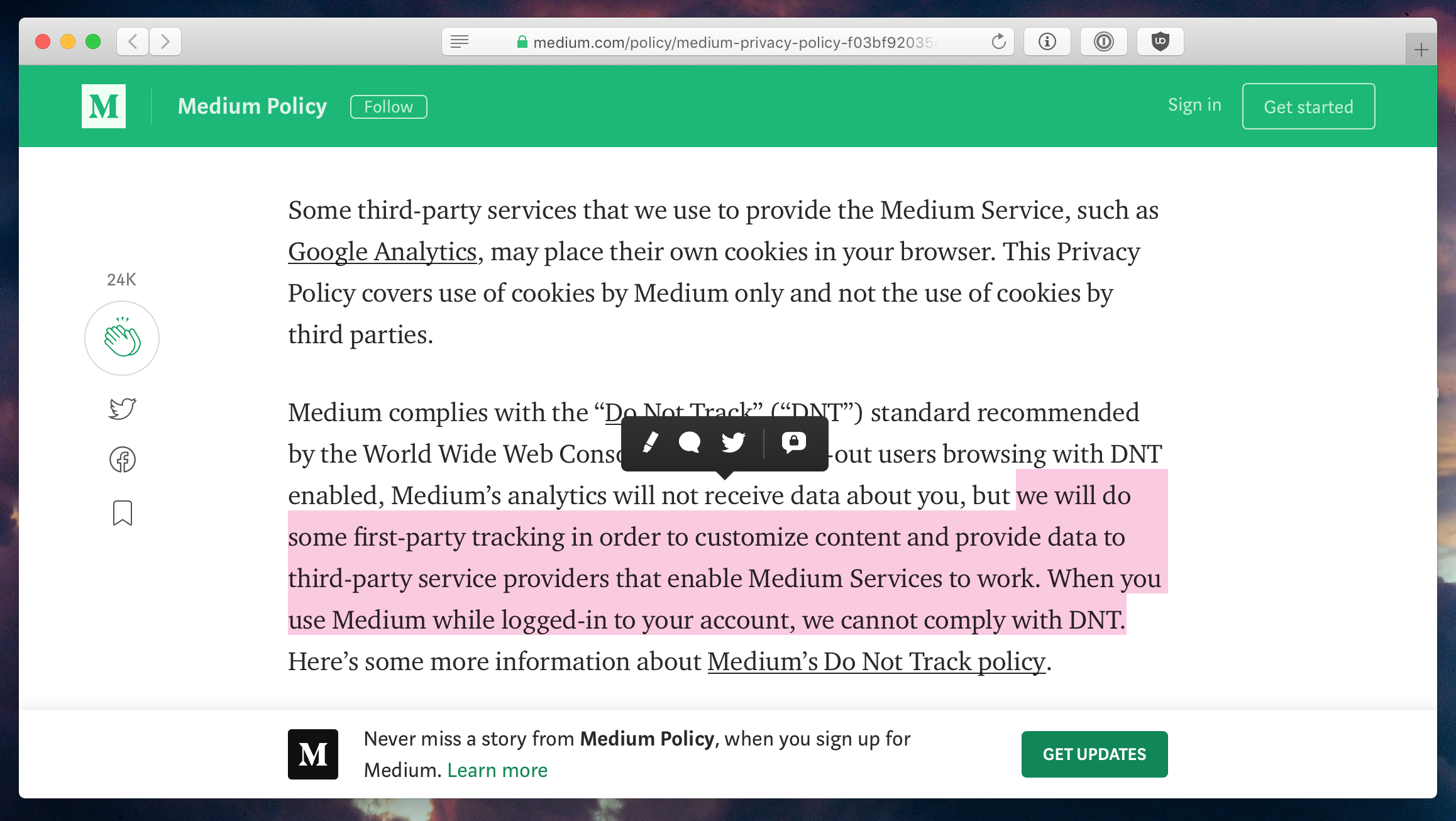
Putting letters on a webpage is “impossible” without collecting your profile. Or so they say. Static HTML is not disruptive enough, I guess.

And it has been a common theme with them. Instead of becoming nice citizens and do what other websites do, they turned themselves into a closed silo that’s either all or nothing. No RSS. Bad reading experience, and I want to highlight it: it’s bad. Bad. Really bad. It’s not good, for any meaning of good you can imagine. There’s no person on Earth who could honestly call it at even partially good. Banners all over the place. Aggressive tracking and profiling.
UPD: Cookie banner. Really slow UI for replies/discussions. Other people highlights that interrupt your reading flow.
UPD2: More valid points from @ourielohayon: bad comments, unnecessary dropdowns for important controls, mixed comments & stories.
Each one of your readers will have to go through ALL THAT EACH TIME just to occasionally read a couple of paragraphs of text. It’s fascinating, really, how they managed to make plain text so complicated.
Sure, Medium editor is nice. Typography is good (for English, other languages are not supported). Publishing is free. So the ones who pay for all that are your readers. Basically, you’re selling readers to aggressive Medium self-advertising so that Medium could make laughably small money from a miserable fraction of them. And annoy the hell out of everyone else.
Next time you think of publishing anything on the web, please, please, PLEASE consider something else.