Humble Chronicles: The Layout
This is a second post documenting the process of developing Humble UI, a Clojure UI framework. In this post, we discuss Humble UI approach to layout.
None of the decisions are complete or final and might change at any time. The main purpose of these posts is to share ideas and get a better understanding of what can work and what can’t. Feedback is welcome!
UI Scale
The way I like to think about it is this:
- 1 physical pixel is 1 set of diodes on your screen.
- 1 logical pixel is an abstract unit of measurement that interfaces are described in.
Logical sizes stay the same between screens, physical sizes vary depending on pixel density and OS settings.
Logical pixels are converted to physical ones by multiplying them to UI scale. Old-fashioned 1080p screens usually use UI scale of 1.0. Retina screens use UI scale of 2.0. For Windows and Linux, UI scale could be any number: 1, 1.25, 1.5, 1.75, 2, 2.5 are all reasonable UI scales.
Humble UI approach is simple:
- All render surfaces are in physical pixels.
- UI scale is an arbitrary floating-point number set once per window.
- By default UI scale is set to OS settings, but could be also arbitrarily adjusted.
- All component sizes are defined in logical pixels.
- Logical pixels are floating-point, physical pixels are integers.
- All sizes (e.g. component width/height) are rounded to physical pixels.
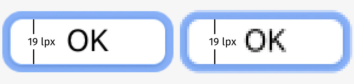
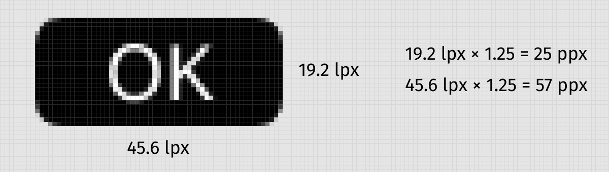
So there could be no 20.5 physical px button in Humble UI, but 20.5 logical px—why not? As long as physical result fits the physical pixel grid, we are happy:
UI scale is not a hard-coded number, does not have to match OS setting and everything in Humble UI is scale-aware and ready to render at any scale.
By default, it is used to match OS settings, but can also be used to easily zoom your UI per window:
Layout model
Internally layout is implemented through IComponent protocol:
(defprotocol IComponent
  (-measure [_ ctx size])
  (-draw    [_ ctx size canvas]))
-measure returns component’s intrinsic size, given the available space of size.
-draw must draw a component filling given size.
Draw calls are top-down: starting from the outermost container, we divide space and ask internal components to fill it.
Measures are bottom-up: if you want to measure a container, it asks its children to measure themselves, then combines the results.
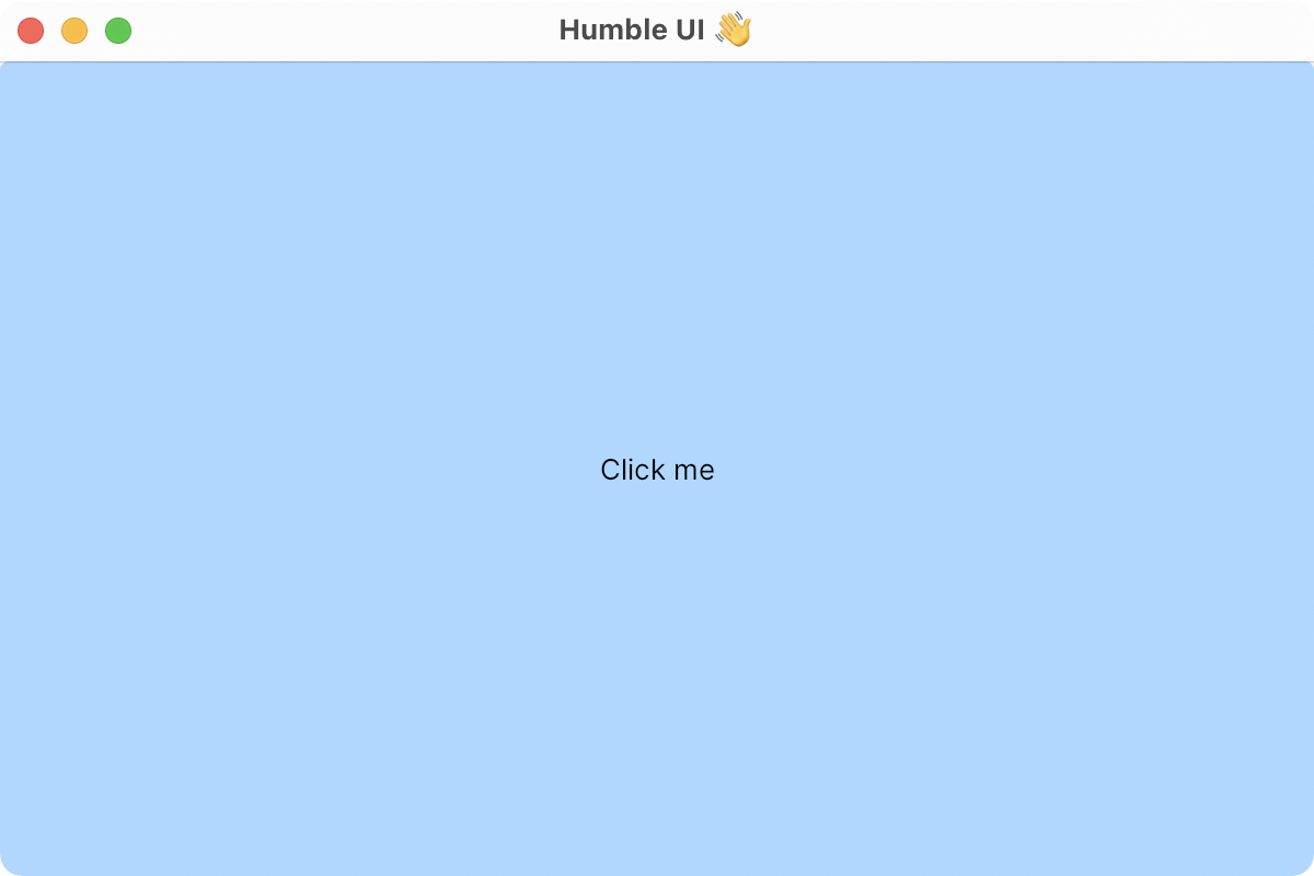
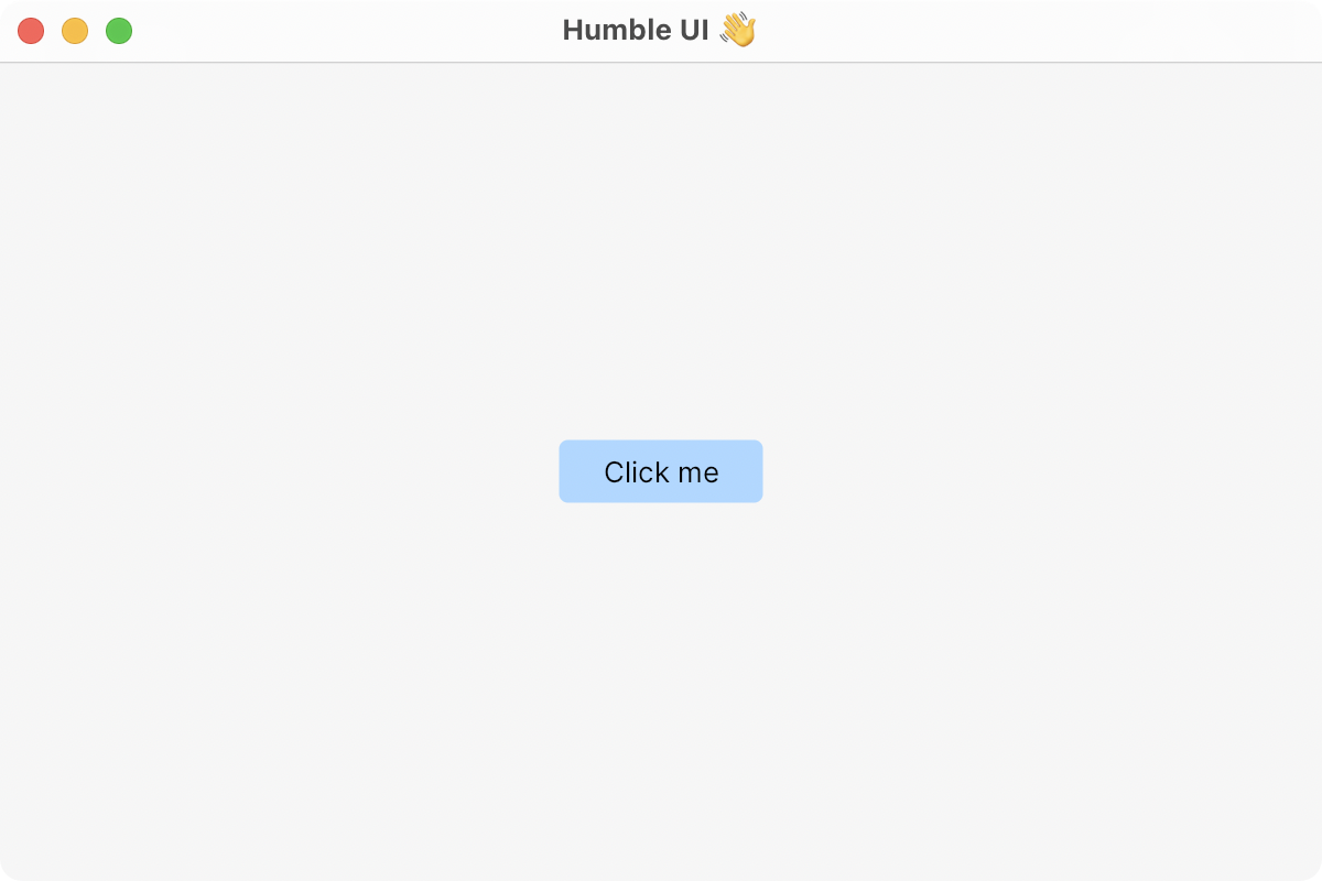
If you put a button directly into a window, it will fill the whole window:
Under the hood, a window will just ask the button to -draw with a known window size:
(-draw button ctx {:width 600 :height 400} canvas)Alternatively, if you wrap the button with align to center it, the situation will change:
- Window will ask
aligncomponent to-drawat window size; alignwill-measurebutton to determine its intrinsic size;alignwill translatecanvasand then ask the button to-draw, but with its own previously determined size.
So far this model proved sufficient enough, we’ll see how much it can handle as Humble UI evolves.
Stretch by default
Button stretching to the full window might sound counter-intuitive at first, but if you think about it, it’s the only logical thing to do: button inside a container without anything else must fill the whole container.
Now, if you want different behavior, you must specify it further. Do you want it aligned to the top left corner? Left centered? Centered stretched? None of these sounds like an obvious default, so you must add it explicitly.
Additive model
Humble UI favors small single-purpose components over settings or modifiers because they tend to compose better.
E.g. there’s no setting on a button to set its width to 300px, but there’s width component that can set width to any child it contains. Same for vertical/horizontal alignment, padding, etc.
This:
(ui/halign 0.5
  (ui/valign 0.5
    (ui/width 300
      (ui/padding 10 10
        (ui/button "Click me")))))
Will get you this:
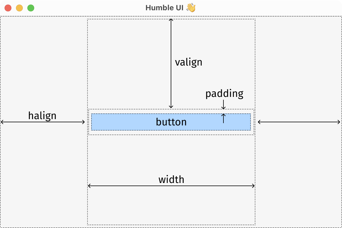
Basically you add more and more stuff until you get what you want. Don’t like something, or want to do something differently? Pull it apart, replace, add, all without modifying components themselves.
Looks a little verbose, but hopefully this approach will be more “simple than easy” and faster to understand than, say, CSS.
The tricky part was to figure out a model that actually combines well. At various stages, I’ve seen component stretching or not stretching where expected, halign not being able to be nested inside valign and vice versa, halign not working inside column/valign inside row and many others.
But all well that ends well, and I am happy with where we are at right now:
Gaps and margins
One thing I feel very strongly about is margins in CSS. Consider following UI:

If you try to describe it with words, you would say something like “profile picture, profile link and logout link with 10 px between components”.
We think about 10 px spacing as its own thing, part of the layout, not part of the components. We don’t say “profile picture with 10 px right margin” because that’s not how we think.
In CSS, however, the way to add spacing between components is to modify components themselves, adding the right margin, like this:
.userpic { margin-right: 10px; }
There are three main problems with this:
- Components with margins are hard to reuse. That’s because margins make sense only in a certain context. They belong to the container, not to the component.
- First/last components need special treatment because you don’t want 10 extra pixels there.
- How do you decide if one should use the left or right margin?
Space between components doesn’t naturally belong to one or the other. It’s literally between them.
So naturally Humble UI does not have margins. What do we have instead? Gaps!
(ui/row
  userpic
  (ui/gap 10 0)
  proflie
  (ui/gap 10 0)
  logout)
Gaps are great because they are simple things that you add to your layout instead of modifying existing components. Logically they live on the same level as other container children, which is where they belong.

They are also easy to work with and have a simple conceptual model: they are just blocks, like any other block.
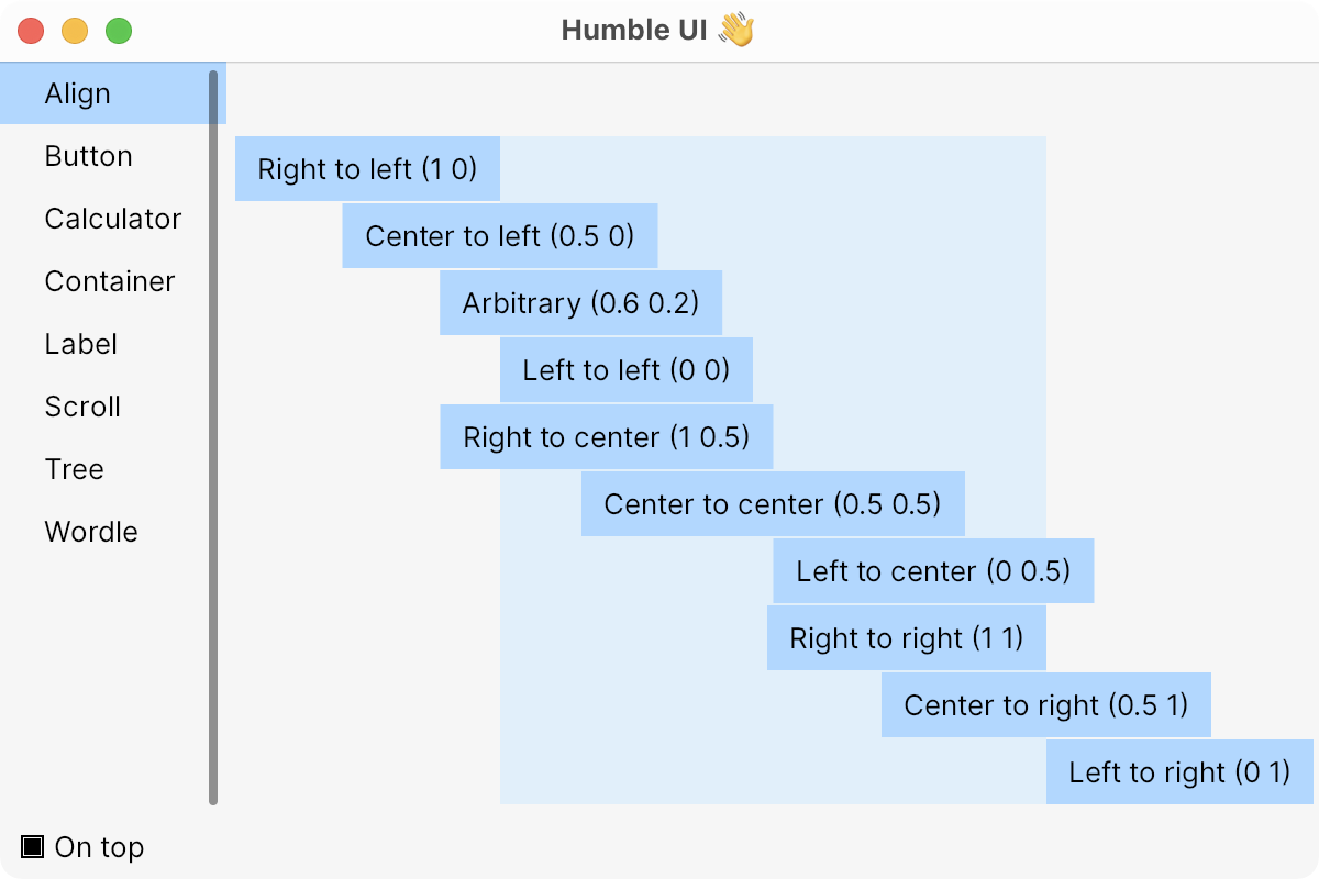
Universal align
Align idea is stolen from Flutter, with the only difference being that I split horizontal and vertical aligns into two separate components.
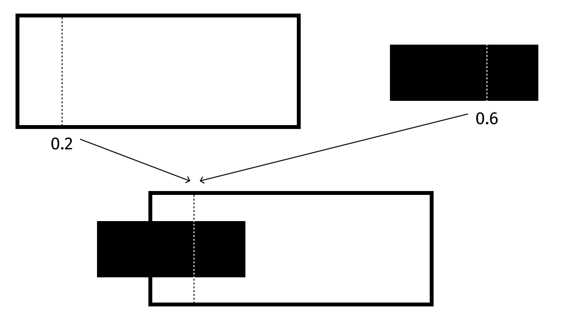
To align something inside a container, you specify two numbers: percentage of the child’s width and percentage of the container’s width.
(<container>
  (ui/halign 0.6 0.2
    <child>))
will get you:
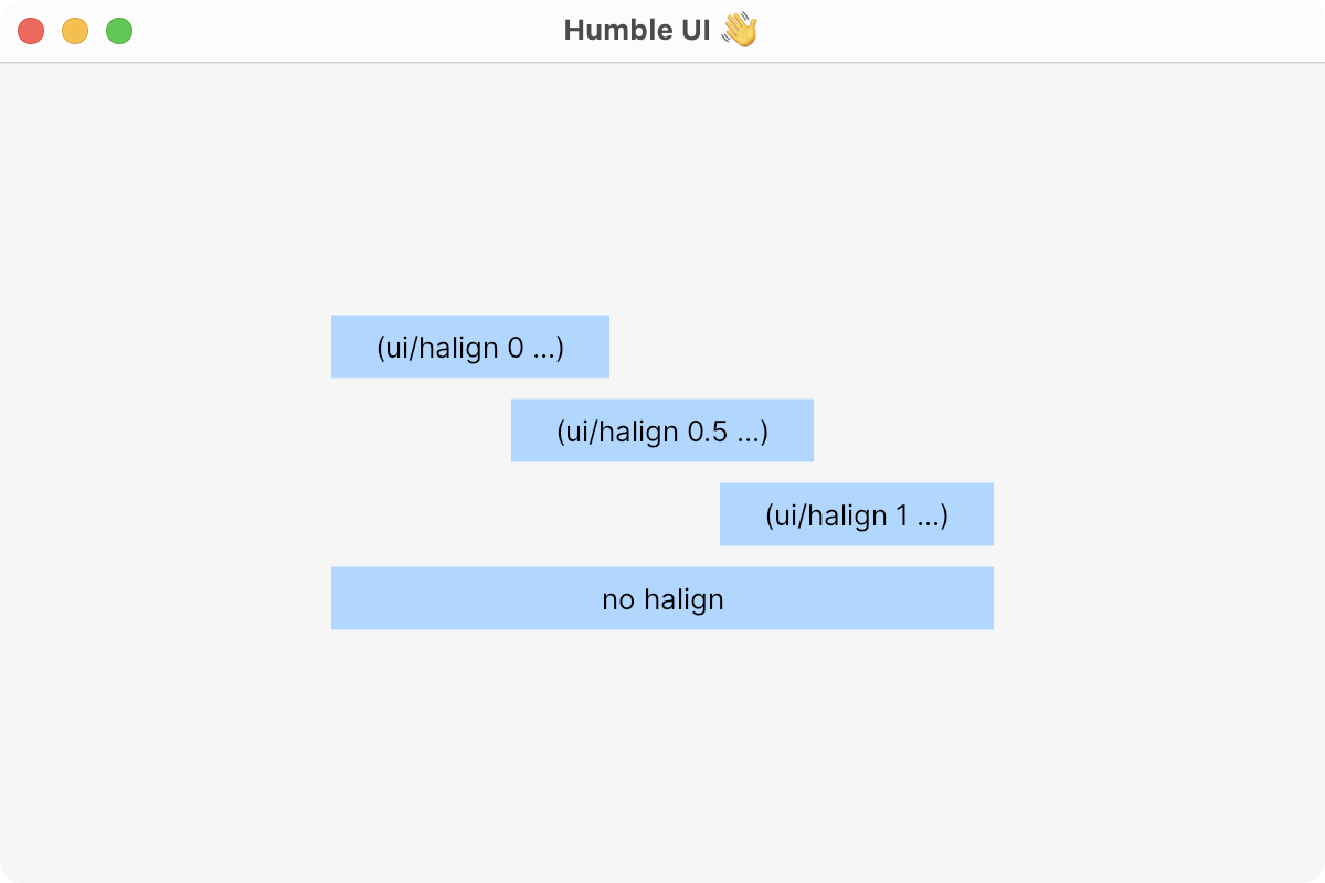
What’s cool about this model is that it gives you all the usual alignment modes:
(ui/halign 0.0 0.0) => left
(ui/halign 0.5 0.5) => center
(ui/halign 1.0 1.0) => right
and then some:
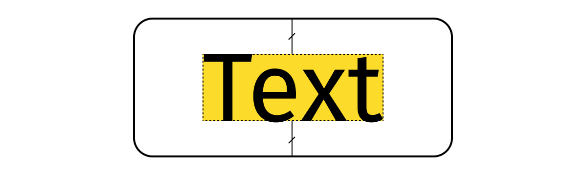
Text bounding box
If you read my deep dive into font construction, you know that I don’t like how text is aligned right now on the web. Humble UI feels like a good moment to revisit it and improve on the status quo.
In short, text boundaries in Humble UI are defined by baseline and cap-height, not by ascender/descender/em square or any other arbitrary unit.

What are the upsides?
Text inside buttons is easy to center:
Baseline alignment is the same as center alignment:

Text aligned to picture looks good by default:

Line height is easier to control (remember gaps?):

But wait, what about ascenders/descenders? They will render outside the boundary box? Yes they will:

I don’t consider that a problem because most of the time you add extra padding around text blocks anyway.
Dynamic sizes
Remember calc from CSS? Well, you can do a similar thing in Humble UI, but using plain Clojure code:
(ui/width
  #(-> (:width %)
     (- (* 3 padding))
     (/ 2)
     (+ padding))
  (button "C" color-clear))
Variables, functions, macros—all at your fingertips.
Works everywhere a dimension is needed: e.g. in padding component.
What’s next?
Notable missing parts are:
- multiline text blocks (paragraphs),
- wrappable containers.
Hope to add them soon. Meanwhile, you can play with the code here.
Am I missing something else? Do you have an opinion? Make sure to let me know!