Font size is useless; let’s fix it
Translations: Chinese Japanese Russian
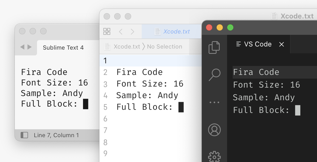
What happens when you set "font_size": 32 in your favorite editor? I would’ve told you anyway, but I’m glad that you asked.
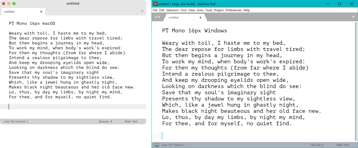
Let’s try to guess. I am using Sublime Text 4 on macOS:
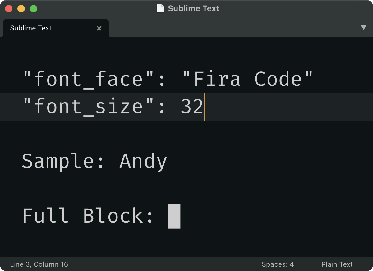
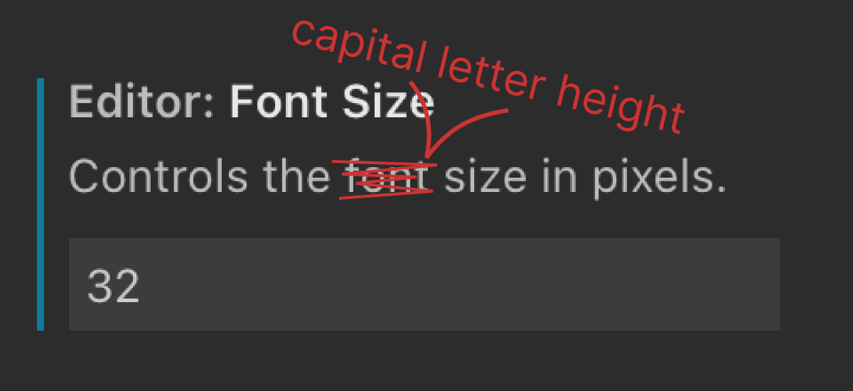
If we measure letters themselves, number 32 is nowhere to be seen:
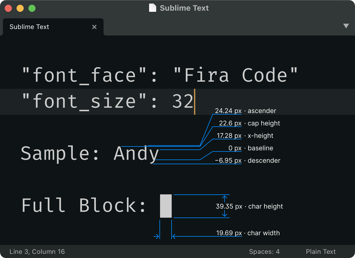
32 is not the width or height of a letter, neither is it a capital letter height, an x-letter height, an ascender height, a descender height. What is going on?
Points
First, that size is not in pixels, it’s in points. Point is a physical unit of measure, equal to 1⁄72 of an inch (0.353 mm), originating from typography.
The idea here was that you set font size directly in physical units, ignoring minute details like screen resolution. If I want to see my letters 2 inches tall, I can do that by setting the font size to 144 pt.
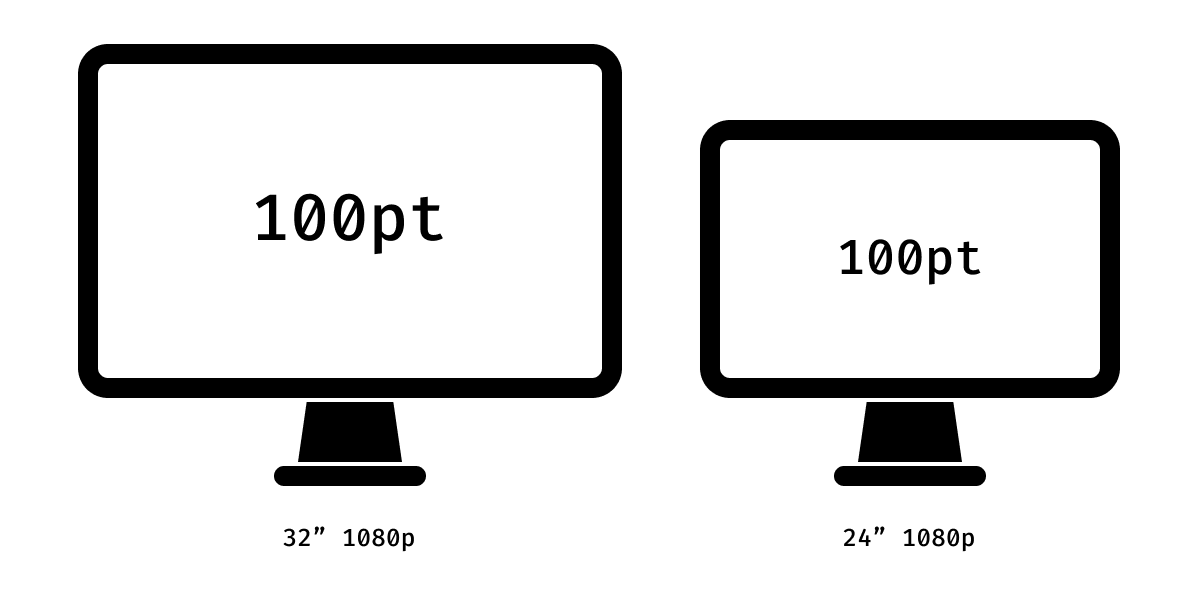
In practice, nobody does that. Instead, macOS always uses 72 PPI to convert points to pixels. If you put macOS on a 32" monitor and a 24" monitor, both set to 1080p resolution, you’ll get identical pixel size, but not physical size, undermining the original idea.
Why the number 72? Turns out, original Macs used to have displays with exactly 72 PPI. If you view text there, its physical size on the screen will match its physical size when printed. Nice! Of course, Mac displays have improved their PPI since, but the convention stays.
In the spirit of true cooperation, Windows uses 96 PPI instead of 72. Why not 72? Not because they had better displays (they didn’t), but because 72 gave you too few pixels to render a legible text. So they figured, why not make everything ⅓ larger?
And they did, indeed. This holds to this day: 16 pt text on Windows is ⅓ larger than 16 pt text on macOS. Fun!
P.S. VS Code seems to take editor.fontSize value directly in pixels. That’s a start!
Em Square
So user requesting 32 pt font is actually requesting 32 px on macOS and 43 px on Windows. But these numbers are still nowhere to be seen.
This is because font-size sets the so-called “em” size.
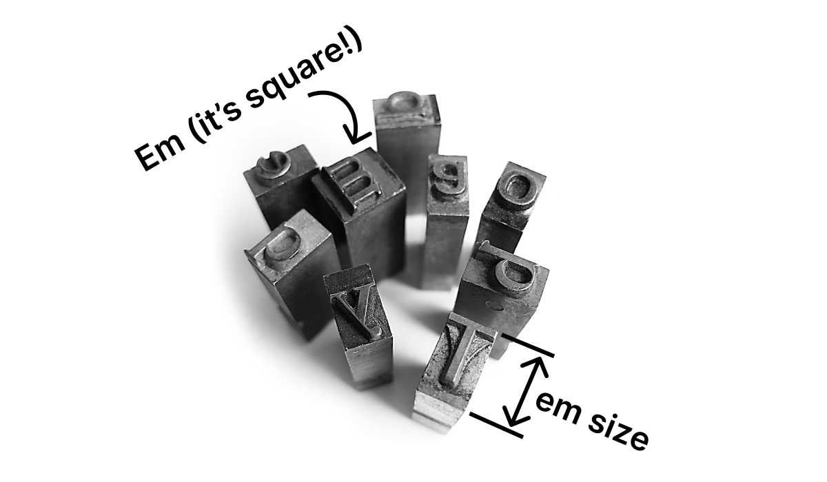
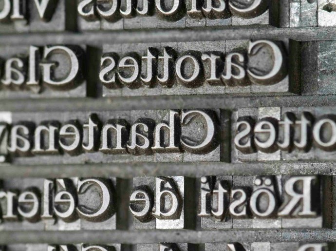
In traditional metal type, em size is the height of the character piece.
Why was the height called “em size”? Because letter “m” was coincidentally a square, and “m” width == character piece height == em size. Simple!
In a digital type, though, an “em square” is (and I’m quoting Wikipedia):
a grid of arbitrary resolution that is used as the design space of a digital font.
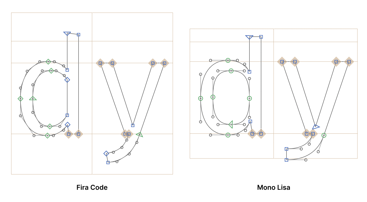
Meaning, if I open Fira Code and draw em square, it will not align with anything at all:
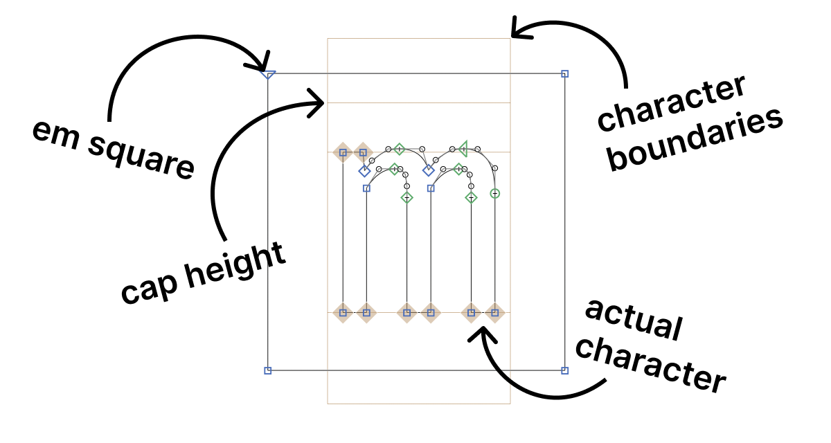
Long story short, this square is what you actually control when setting font size. This square will be 32/43 px tall/wide if you set the font size to 32 pt. Too bad it’s invisible and no element in font matches it.
The problem
When I say em size is absolutely arbitrary and is not related to anything in the font at all, it’s not an exaggeration. It actually is not!
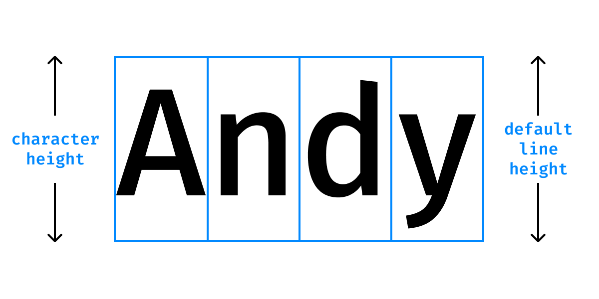
That means that different fonts set at the same size might have drastically different perceived size. For example, if I align em squares (== set same font size) from two different fonts, I get very different “m” height:
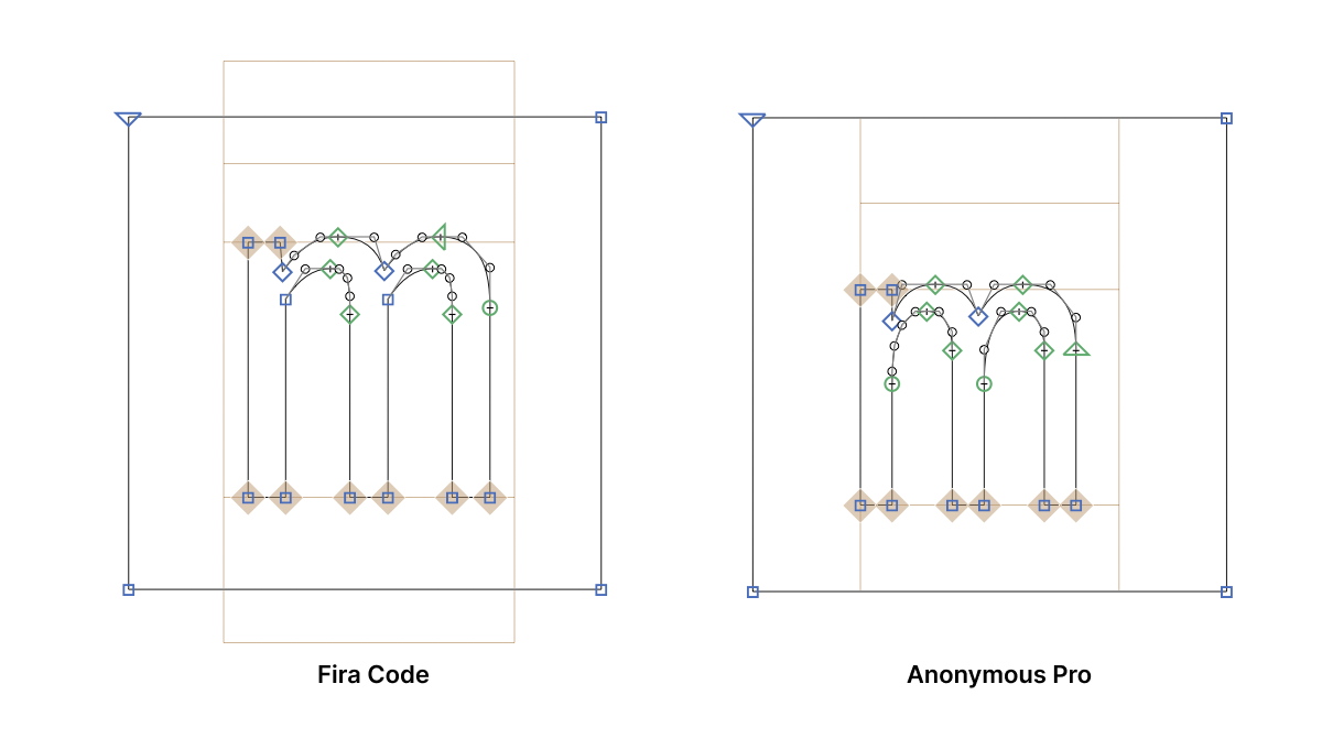
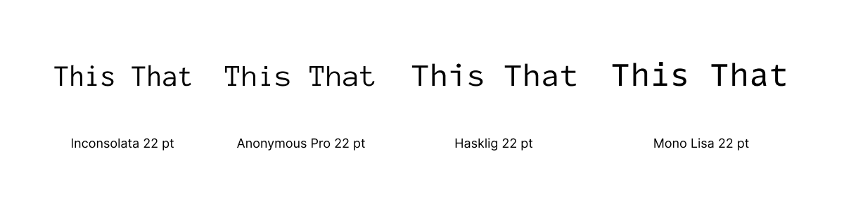
Another example. All these fonts have the identical size of 22 pt:
I see the following problems with font size:
- Unpredictable: you can’t guess what you’ll get. 16 pt means how many pixels, exactly?
- Not practical: you can’t get what you want. Want letters to be 13 px tall? Can’t do it.
- Not stable. Switch to a different font, keep the same size, get bigger/smaller letters.
- OS-dependent. Get different rendering when opening a document on a different OS. Can’t share editor config between macOS and Windows.
The solution
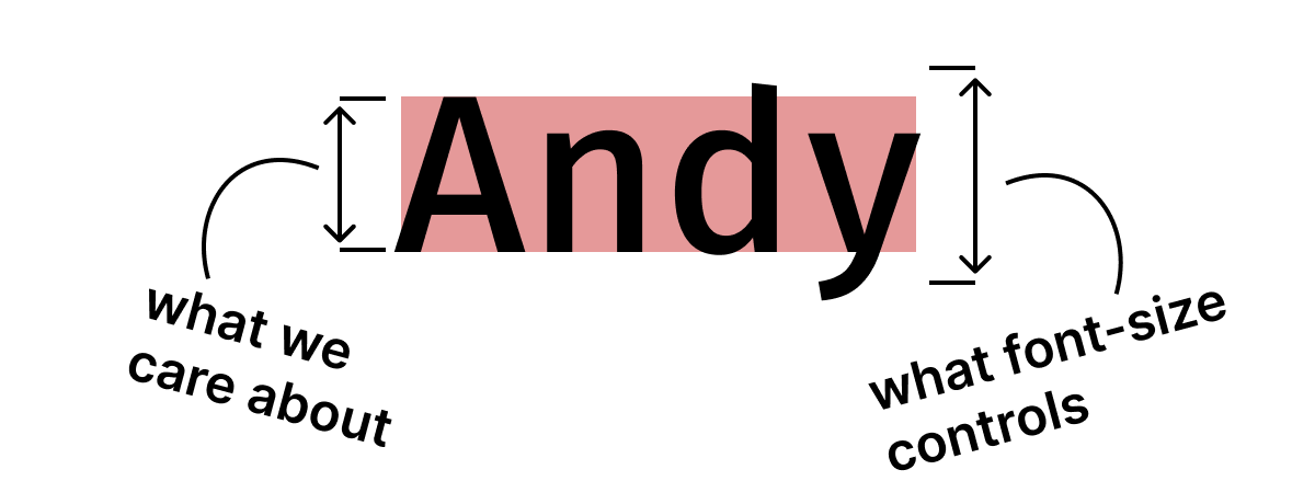
- Specify cap height, not em square size.
- Specify it in pixels.
Caps are what human eye actually perceives as text block boundary. So it makes sense to control the size of that, not some other arbitrary-selected metric:
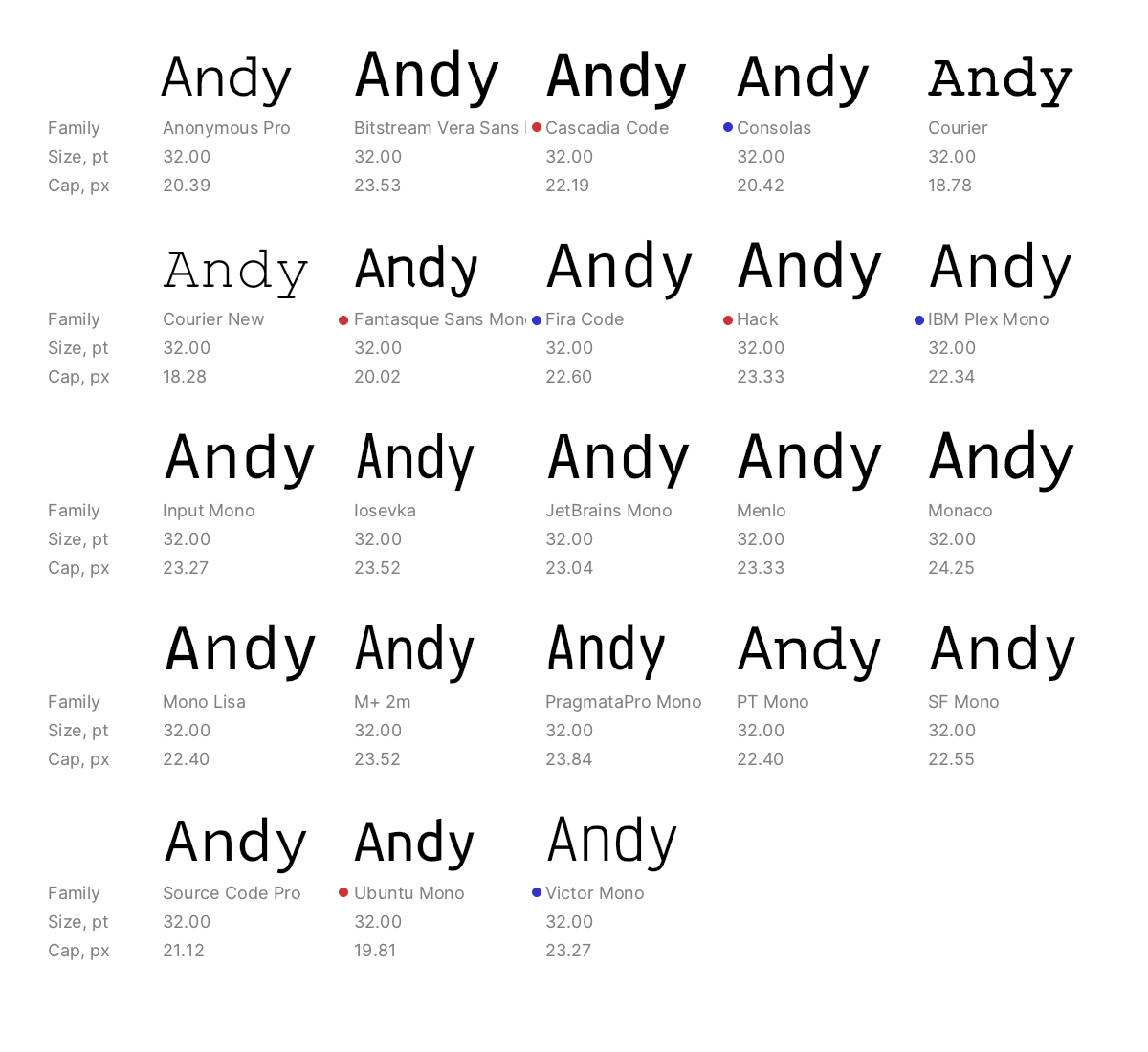
Here are multiple fonts all set to the same font size:
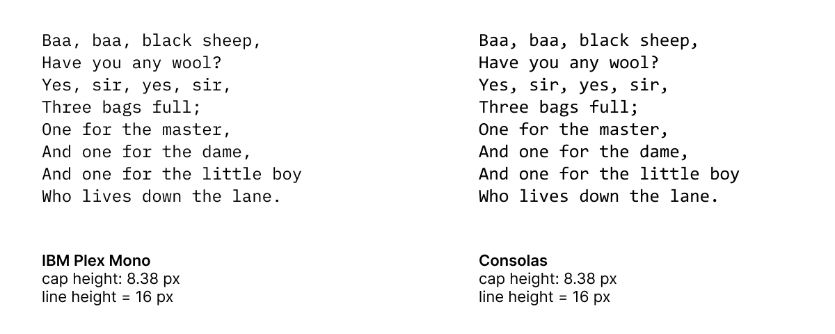
And here are all the same fonts, but resized to match cap height:
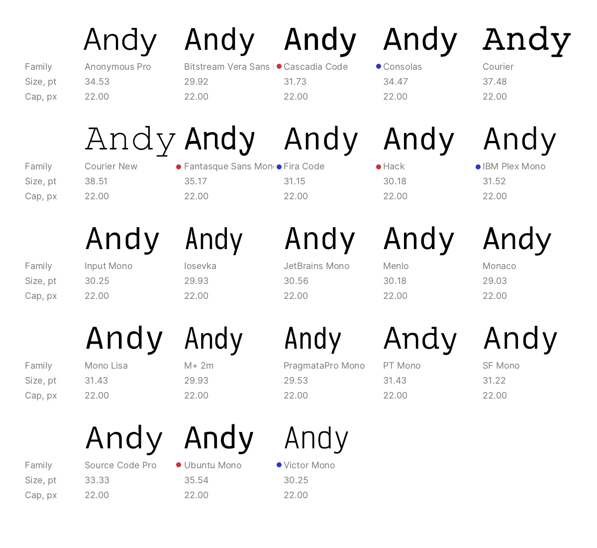
To me, the latter gives much better consistency. Look, for example, at Cascadia and Consolas. Or Hack and IBM Plex Mono. Or Ubuntu Mono and Victor Mono (two last ones).
Line height is a mess, too
While we’re at it, let’s fix line height too? Don’t worry, I’ll be quick.
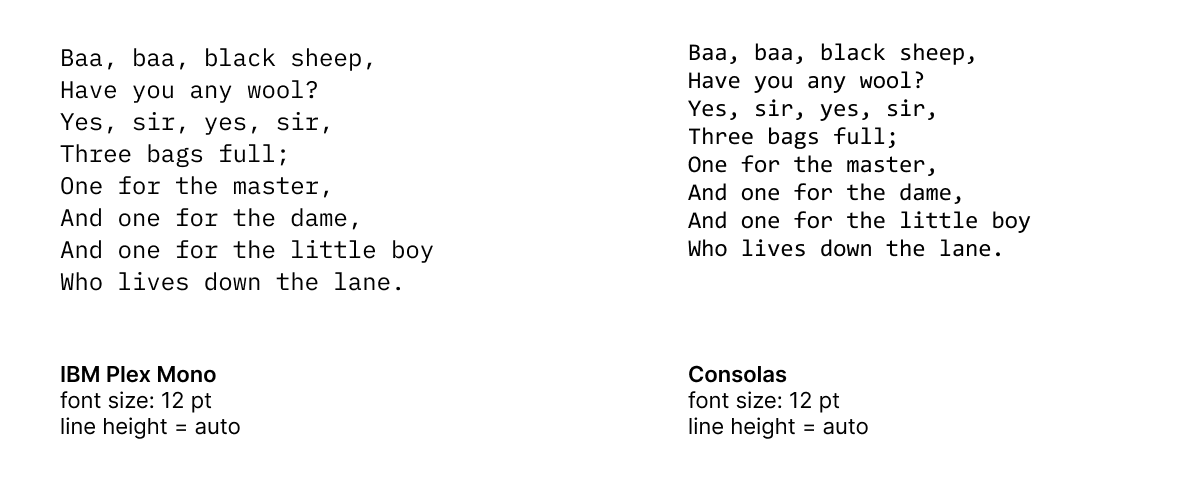
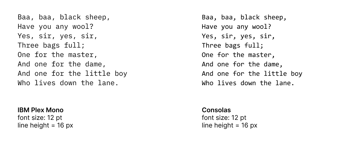
First, there’s clearly no consensus. Everyone is doing their own thing:
Why? The problem with line height is that it’s calculated from the same abstract character boundaries:
This convention made sense in metal type. After all, you can’t have a line shorter than letter’s body:
But it doesn’t make sense in digital typography! Same as with font size, the amount of empty space above and below letters can be absolutely arbitrary.
Some give it a lot of extra space. Others allocate just enough to fit ascender and descender:
Even with the latter, it is still not what we want! Ascenders and descenders are outliers and do not affect the perceived text box. Technically, of course, the minimal line height should fit them both without intersection, but aesthetically, it’s far from the best choice.
With the amount of freedom that font designers have at defining character boundaries, trying to get a consistent line height is a guessing game.
Predictable line height
What to do? The reasonable way is to set line height directly in pixels, ignoring any font metrics. Maybe as a percentage of cap height, too, but definitely not font-size or “auto” line height!
Another important point: never specify line height as a gap between lines (leading in metal type). Otherwise, two different font sizes will break paragraph rythm:
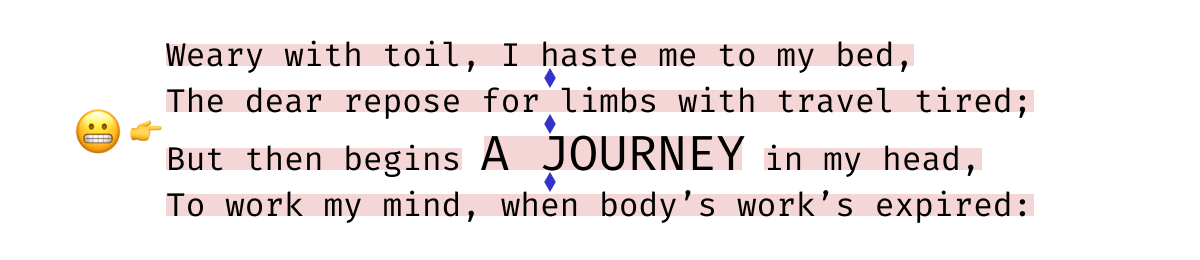
Instead, distance between baselines should be used:
Also, I see no reason to honor the so-called “default line-height”. It’s basically a font designer’s personal preference, imposed on every user of the font in every viewing condition. It can be any number (and often is)! But 200% of cap height is always 200%.
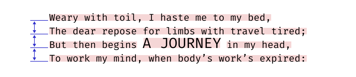
To sum up: This is what we have now. Change a font and get a random line height:
And this is what I want: change font, but all lines stay exactly where they were:
It’s crazy to think that with all these computers, font-wise we’re still stuck with so many quirks from the metal era of fonts.
The endgame
What I am trying to achieve with these proposals is a very simple use case:
- I configure my editor to the preferred font size and line height once.
- I can try out different fonts.
- I don’t need to reconfigure font size and line height from scratch every time I do that.
Like this (both Cap Height and Line Height match exactly):
My dream UI:
The second use case is pretty simple, too: I’d like a predictable and reliable way to center text in a button.
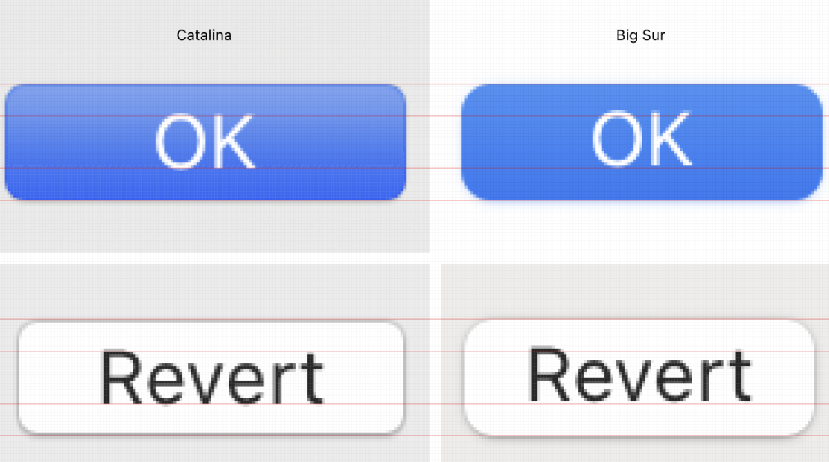
It’s always been a problem on the web, but recently macOS caught that disease too:
Given that you can’t always control which fonts will be used to render your webpage, the lack of a tool to align text reliably seems like an oversight.
Links
Getting to the bottom of line height in Figma. Figma adventures in finding a compromise between what people want and what the web actually does.
Deep dive CSS: font metrics, line-height and vertical-align. An excellent article explaining how exactly fonts and CSS line height algorithm works. Also: see, I am not the only person with a terrible background color on a website :)
Capsize. A JS library that lets you do exactly what I described in this article, today, within the limits of the web.
Leading-Trim: The Future of Digital Typesetting. How leading-trim (~cap size) would simplify the life for everyone.