Daylight Saving Time is a perfect test for UI designer
I have five clocks in my house. All of them I have to change manually twice a year: one hour back in the Autumn and one hour forward in the Spring. Today was one of these days.
Each clock presents a unique puzzle. Three out of five have no direct controls for changing time, and manuals have long been lost, so I have to figure it out every time.
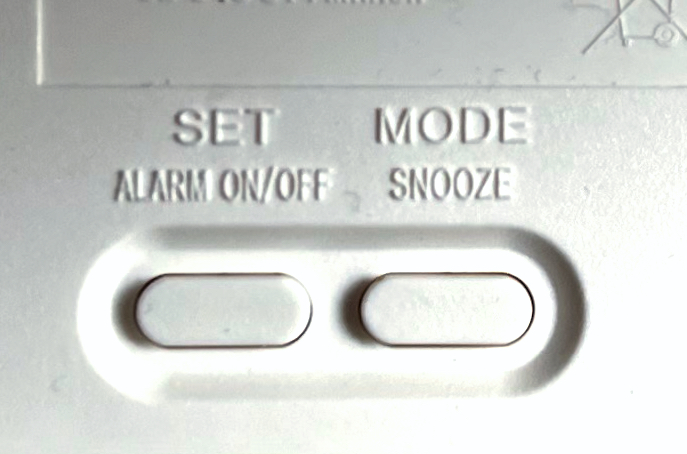
This is Ikea Vikis. It only has these two buttons:
This kitchen timer called Aimilar has seven, but none of them control the clock:
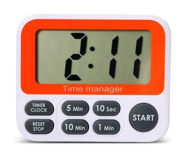
There is a “Timer/Clock” button, but it only switches between these two modes.
Finally, my microwave has this intuitive UI:
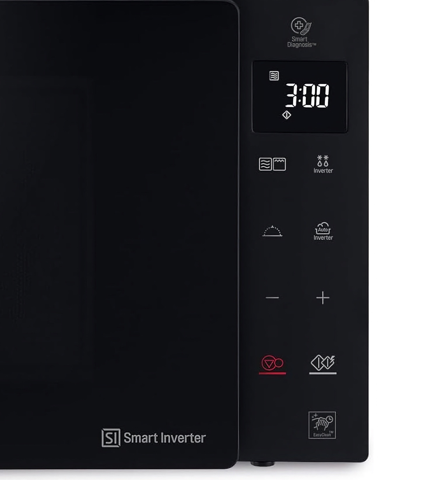
By the amount of “smart” functions you might think it already has AI but luckily it predates AI by several years.
As you can guess, setting time is a game of trial and error. My favorite is the microwave: while setting time is more or less intuitive with − and +, getting in this mode requires unplugging the whole thing.
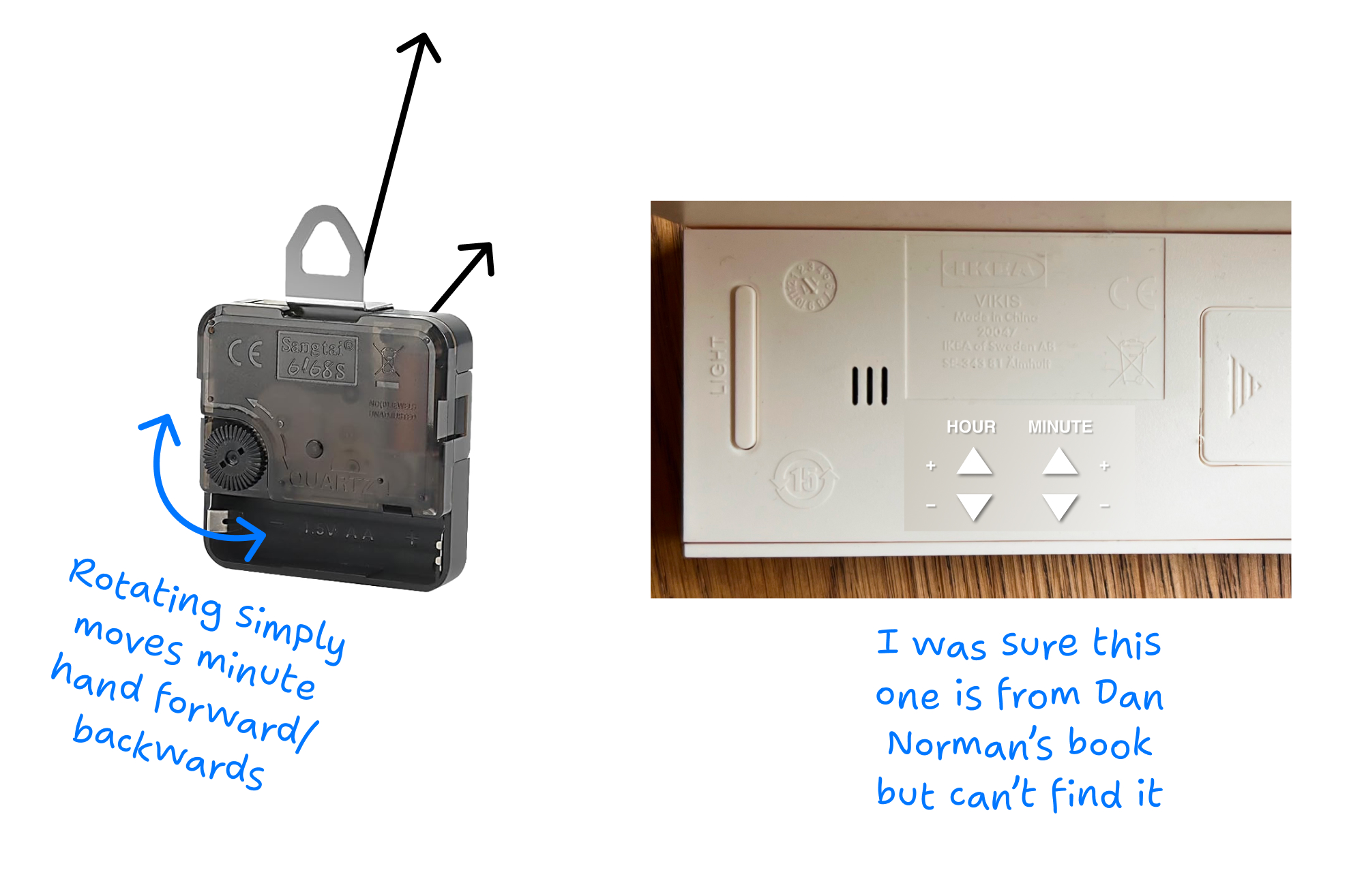
It’s not enough to think inside the world of interface alone, you have to break out into the real world. Hey, the power cord is UI too!
This is a test
So here’s my idea: if you are hiring UI/UX designers, ask them to design UI for a wall clock/kitchen timer, specifically the part that sets the time.
The task has unique constraints:
- Don’t need to optimize for speed of operation, only for clarity
- Should probably not be in your face (only needed twice a year), but also easy to find and understand (conflict in requirements)
- Can’t rely on manuals (will be lost)
- Can’t rely on memory (users will forget anything after 6 months)
- Can’t be too smart (this is very dumb electronics, also manufacturing price considerations)
Of course, it’s not just the resulting UI that should be tested, but also an ability to deduce all these constraints.
If you are curious, my two possible answers are here.
What are yours?
