In Loving Memory of Square Checkbox
Translations: Chinese
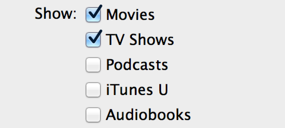
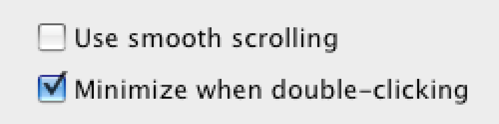
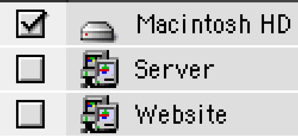
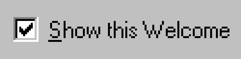
This is a checkbox:

It’s square, it has a checkmark inside, and its distinguishing feature is that you can select any number of them at the same time:

Different operating systems rendered them differently during their evolution:

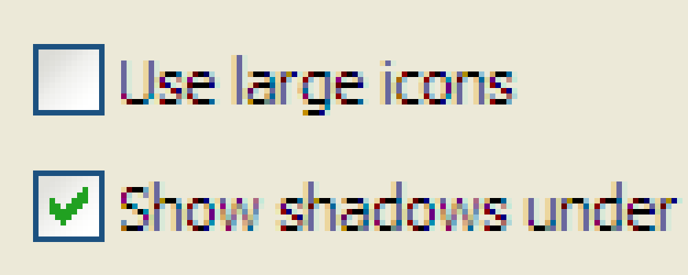
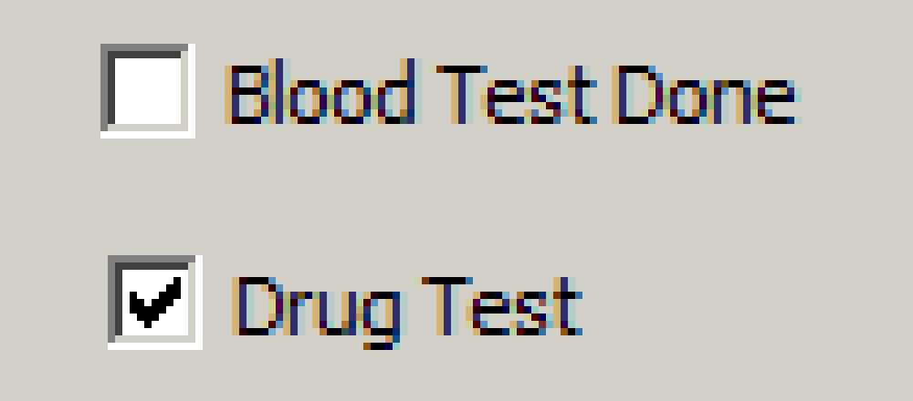
As you can see, even the checkmark wasn’t always there. But one thing remained constant: checkboxes were square.
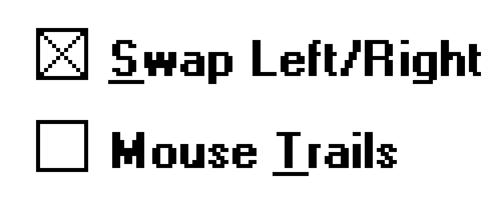
Why square? Because that’s how you can tell them from radio buttons:
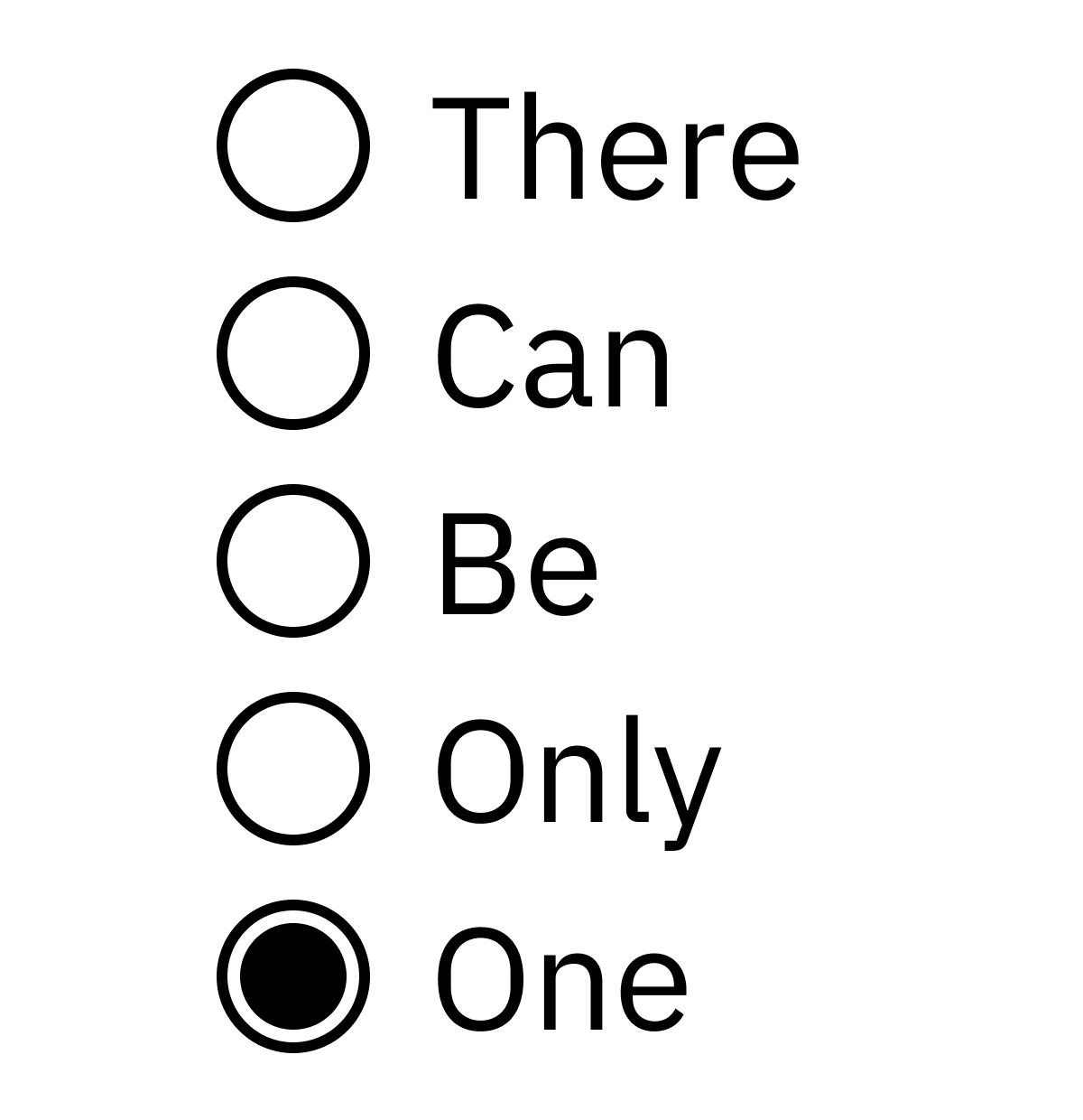
Their distinguishing feature is a single choice. If you select one, everything else is de-selected.
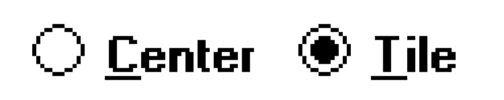
I’m not sure when the distinction between square/round was introduced, but it seems to already exist in the 90-s:
(Guess where [x] is used now? In Markdown! What a comeback, huh?)
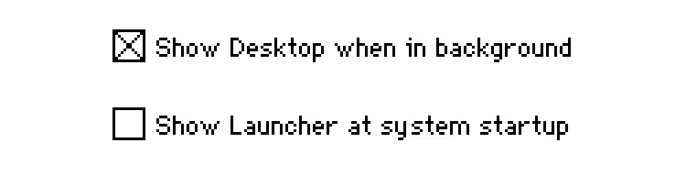
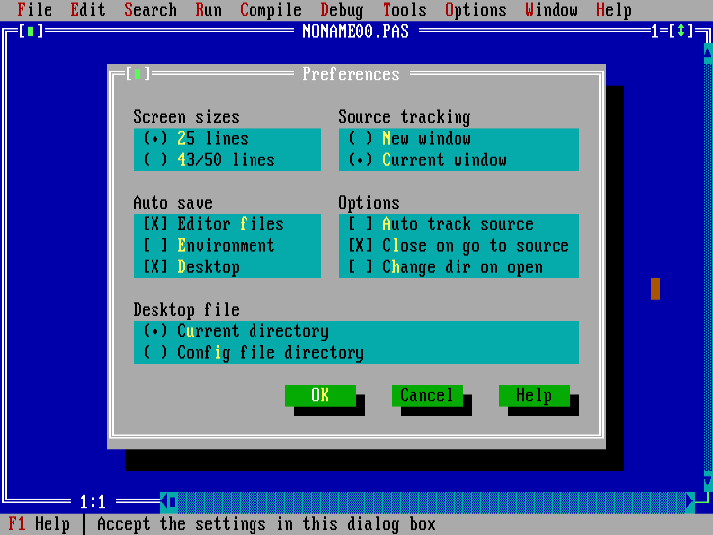
And since then, every major operating system followed this tradition. From Windows 3.11:
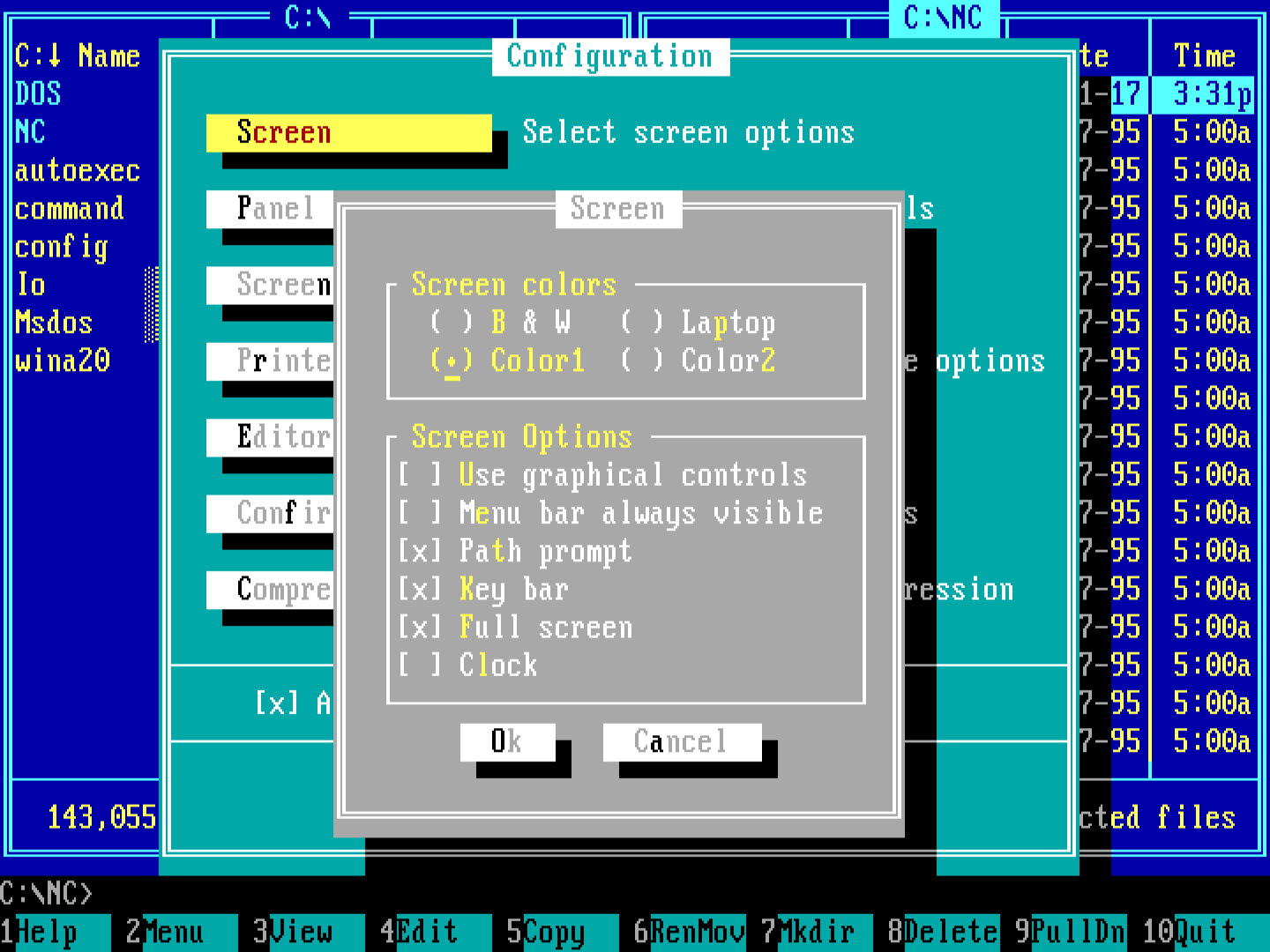
through Windows 95:
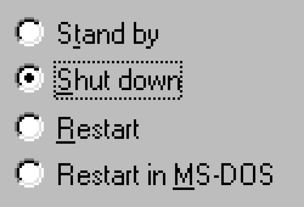
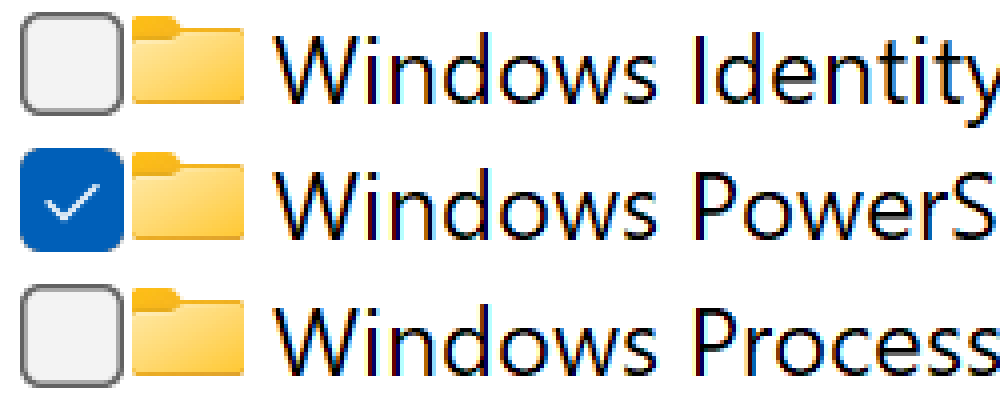
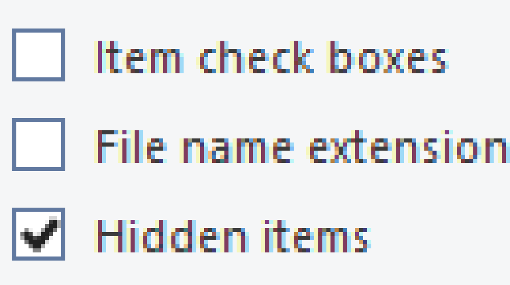
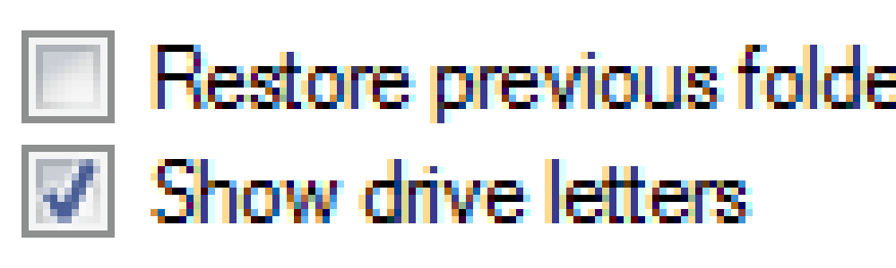
to Windows 11:
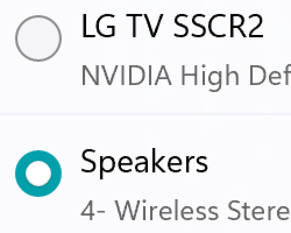
from Mac OS 4:

till macOS Sonoma:
There was a brief confusion up until 1986 when Apple used rounded rectangles instead of circles:
but it was quickly resolved.
The point is, every major OS vendor has been adhering to the convention that checkboxes are square and radio buttons are round.
Then the Web came. And when I say Web, I mean CSS. And when I say CSS, I mean Flash and then JavaScript.
You see, people on the Web think conventions are boring. That regular controls need to be reinvented and redesigned. They don’t believe there are any norms.
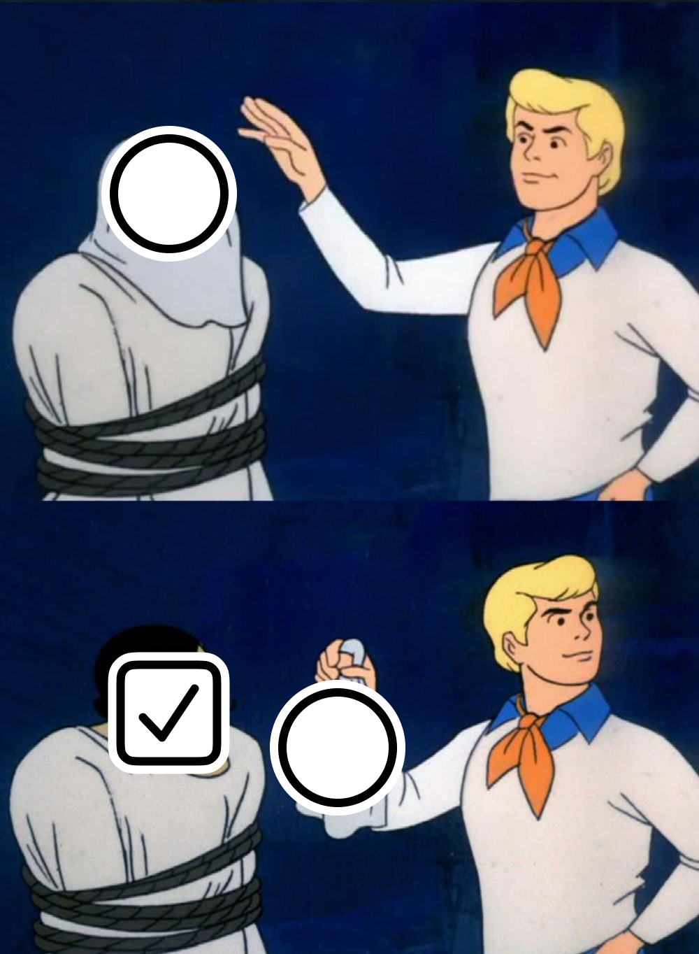
That’s why it’s common to see radio buttons containing checkmarks:
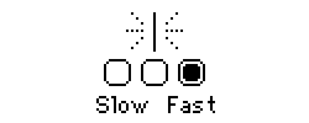
Or square radio buttons:
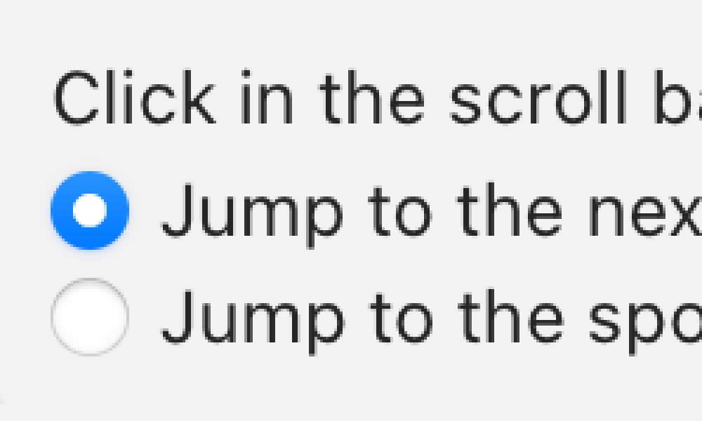
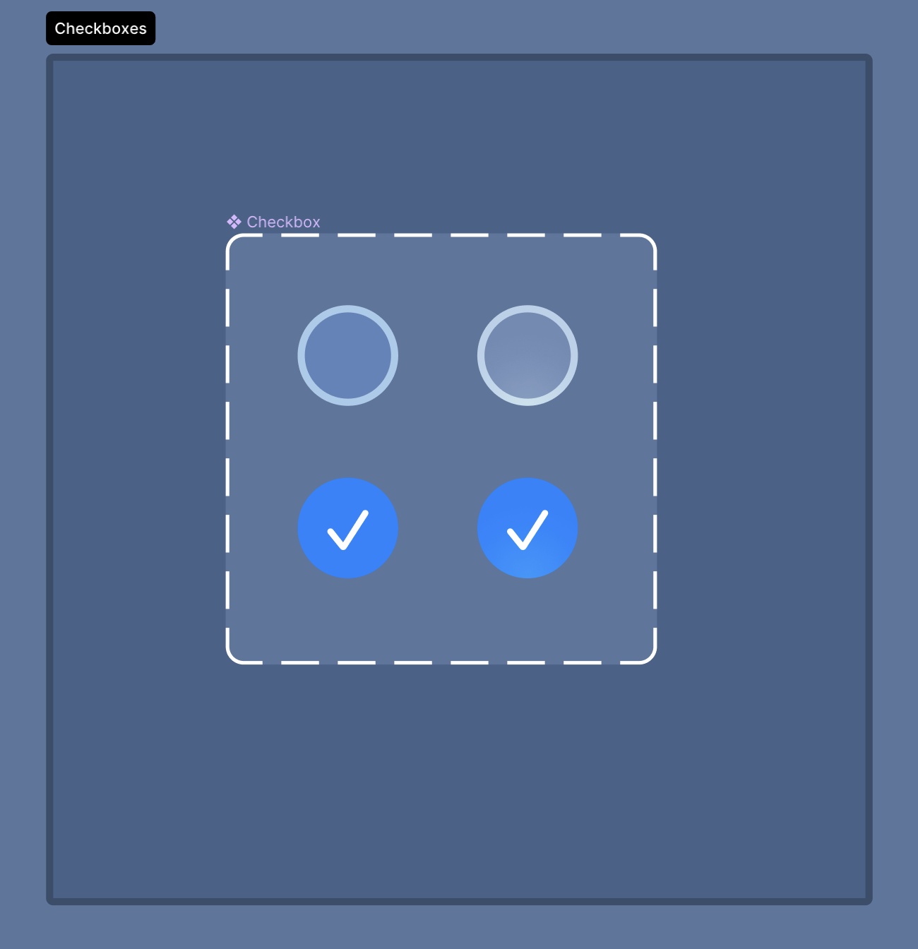
Following the Web’s example, native apps introduced us to round checkboxes:
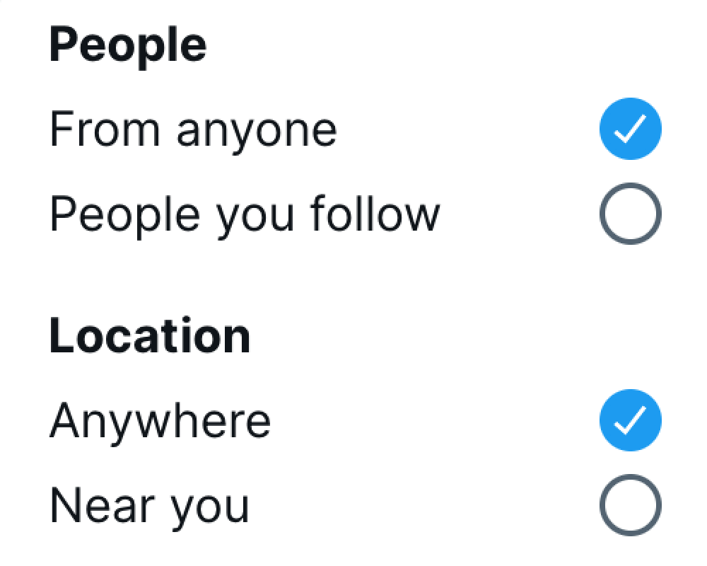
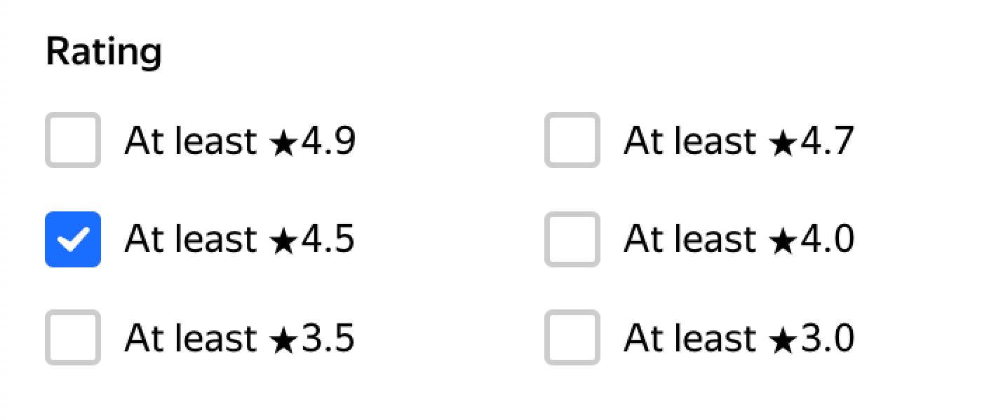
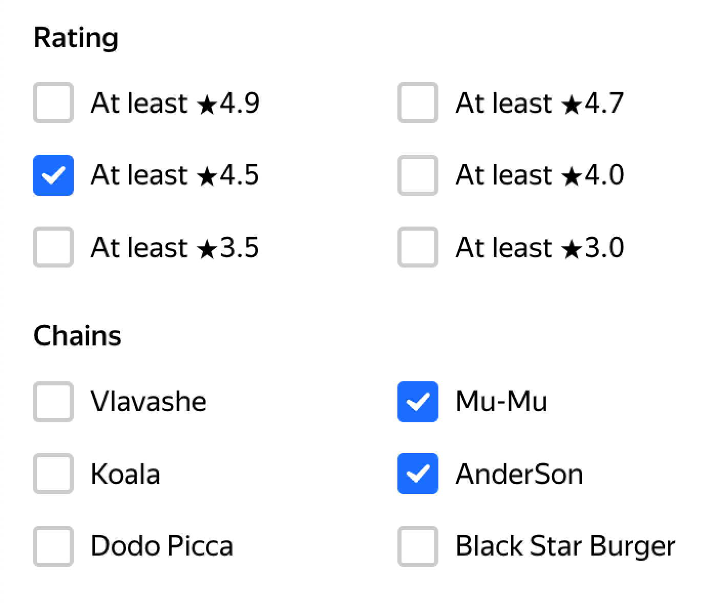
Sometimes people just don’t make distinctions anymore. For example, here the first group is single-choice, while the second one is multiple-choice:
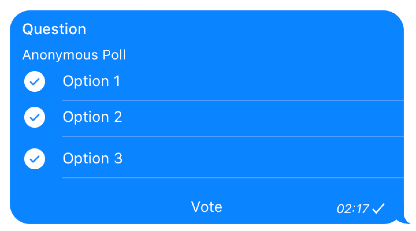
Or here, one of those polls is single-answer, another is multiple-answer:
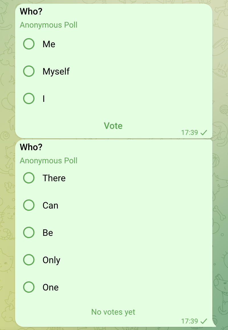
How are people supposed to know?
But despite all this chaos and temptation, operating system vendors knew better. To this day, they follow THE convention: checkboxes are square, radio buttons are round.
Maybe it was part of their internal training. Maybe they had experienced art directors. Maybe it was just luck. I don’t know — it doesn’t really matter — but — somehow — they managed to stick to the convention.
Until this day.
Apple is the first major operating system vendor who had abandoned a four-decades-long tradition. Their new visionOS — for the first time in the history of Apple — will have round checkboxes.
How should we even call these? Radio checks? Check buttons?
Anyway, with Apple’s betrayal, I think it’s fair to say there’s no hope for this tradition to continue.
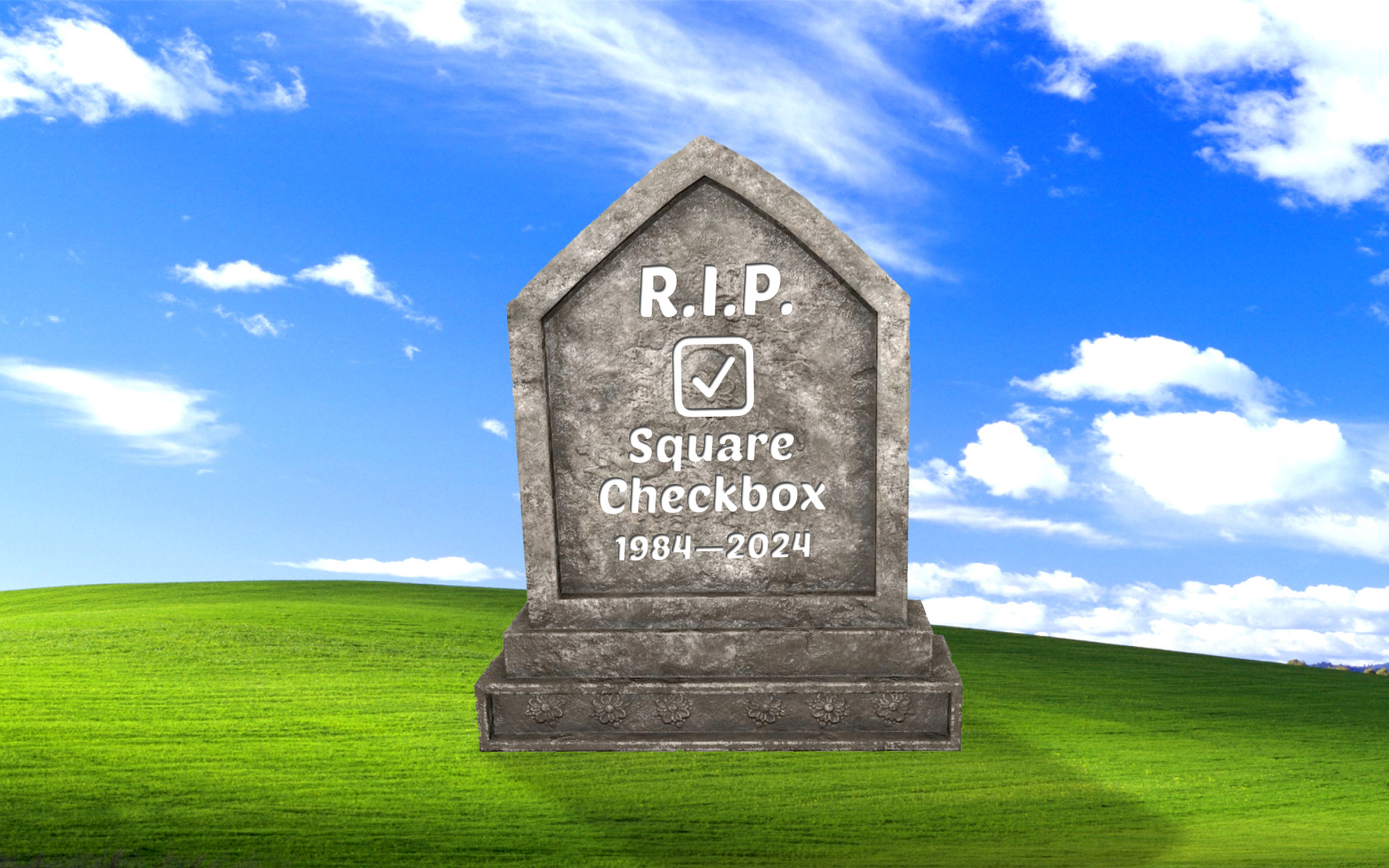
I therefore officially announce 2024 to be the year when the square checkbox has finally died.
Kids these days will use a toggle anyway.
Credits
Resources used to prepare this post: