Redesigning Github repository page
Github design is pretty good: it gets the job done, it’s clean, has consistent visual language, its design is calm and suitable for everyday use.
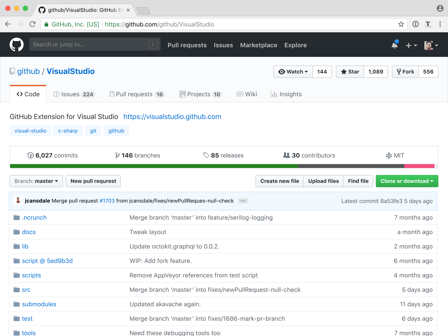
Given all that, there are still many areas that could be improved. Today we’ll take one interface—repository page—and look what UI problems it has and if we can fix them.
First problem: nested tabs
Let’s start with the biggest issue right away: information architecture. Take tabs. Currently there’re two levels of tabs, one nested under the other:
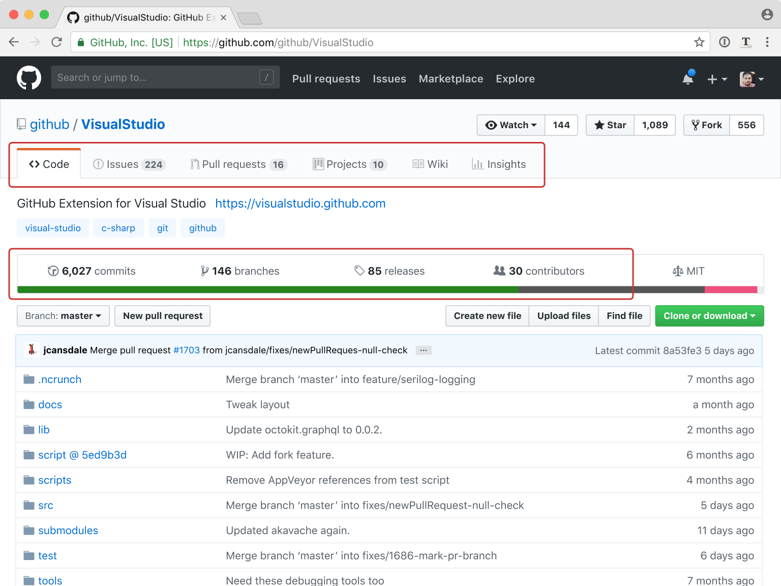
If you are a programmer, you might be surprised but other people normally don’t like hierarchies. Nested structures are hard to grasp, remember, navigate, and grouping is very often non-intuitive. Nested tabs are one of the worst UI patterns out there.
Then there’s a plain usability issue: let’s say I’m in Wiki and need to see Releases. What should I do? There’s no Releases tab visible, so I must figure out somehow that Releases are part of the Code (?). That makes almost no sense. Releases are as much part of the Code as Issues or Wiki are.
Solution here is to flatten all tabs into a single navigational control:
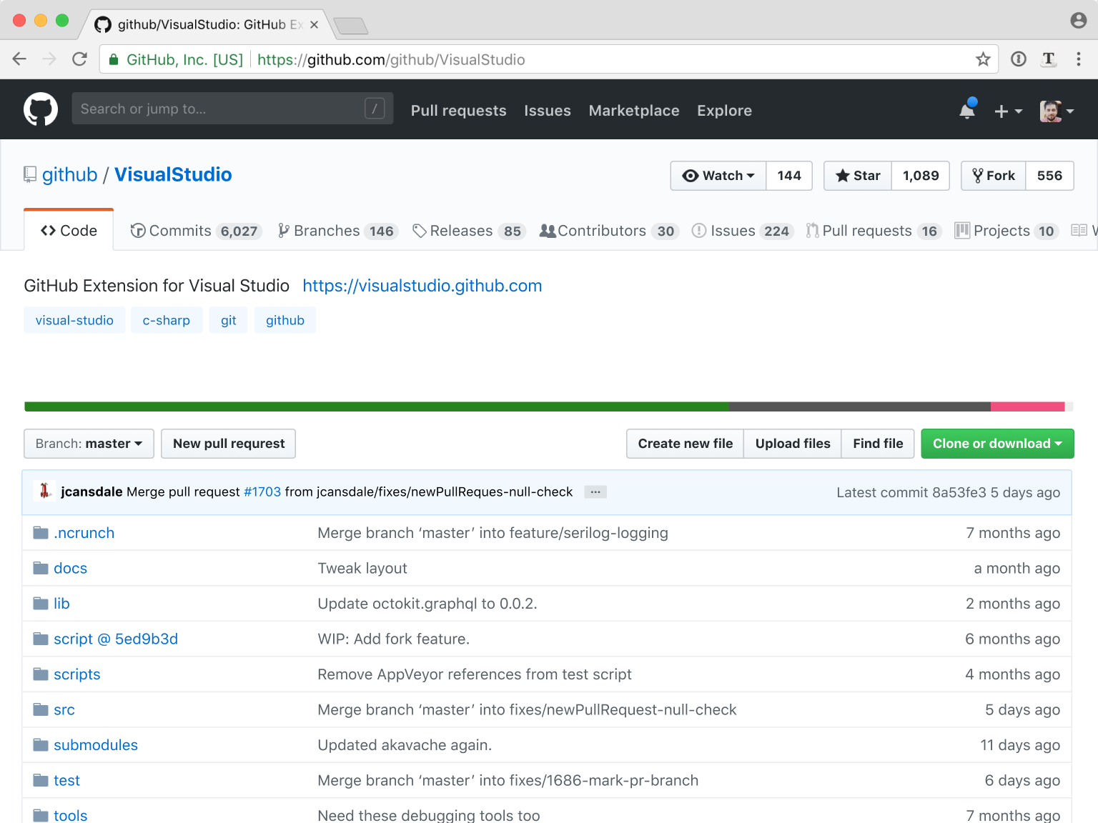
Organized that way, tabs are immediately accessible from anywhere in the repo. This is a big deal.
As a bonus, we also won quite a bit of vertical space without sacrificing anything! Vertical space is very important, it lets you see more content and get to it faster—all good things.
We still have one problem though: tabs don’t fit. We’re going to solve it by removing icons, but let me build up a case for that first.
Problem 2: Redundant icons
Icons are visual cues that help you scan the UI quickly. “Quickly” here means faster than reading text labels. If for some reason reading labels is still faster then icons aren’t working.
One example of icons misuse: if you put too many icons in a row and they are all different, they won’t work.
Prioritizing, or highlighting, something means deprioritizing everything else. You can’t highlight everything.
Another way to fail at icons: if you use obscure graphics, people will have to read labels anyways, so, again, not working.

Now let’s be honest: the domain of repository and project management is pretty abstract. No matter how good you are at design and how hard you try, you won’t come up with a great icon for a commit. Or a release. Or an issue. Or a license. A great icon is something other people know and understand. And for repositories, there’s simply none. I mean,

So Github tab icons are purely decorative. If you don’t believe me, look at what Github itself is doing. They dim icons:

That’s a sure sign that they, too, think it’s near impossible to figure out why backward clock means “Commit”. Github knows people will be looking at the labels anyways.
But even being decorative, they’re bad at it. I mean, Icon + Label + Counter make for a symmetric and weak composition:

By removing icons we:
- free up a lot of horizontal space,
- make design stronger, and
- get rid of visual noize.
Win-win-win! Here’s the result, tabs without icons:
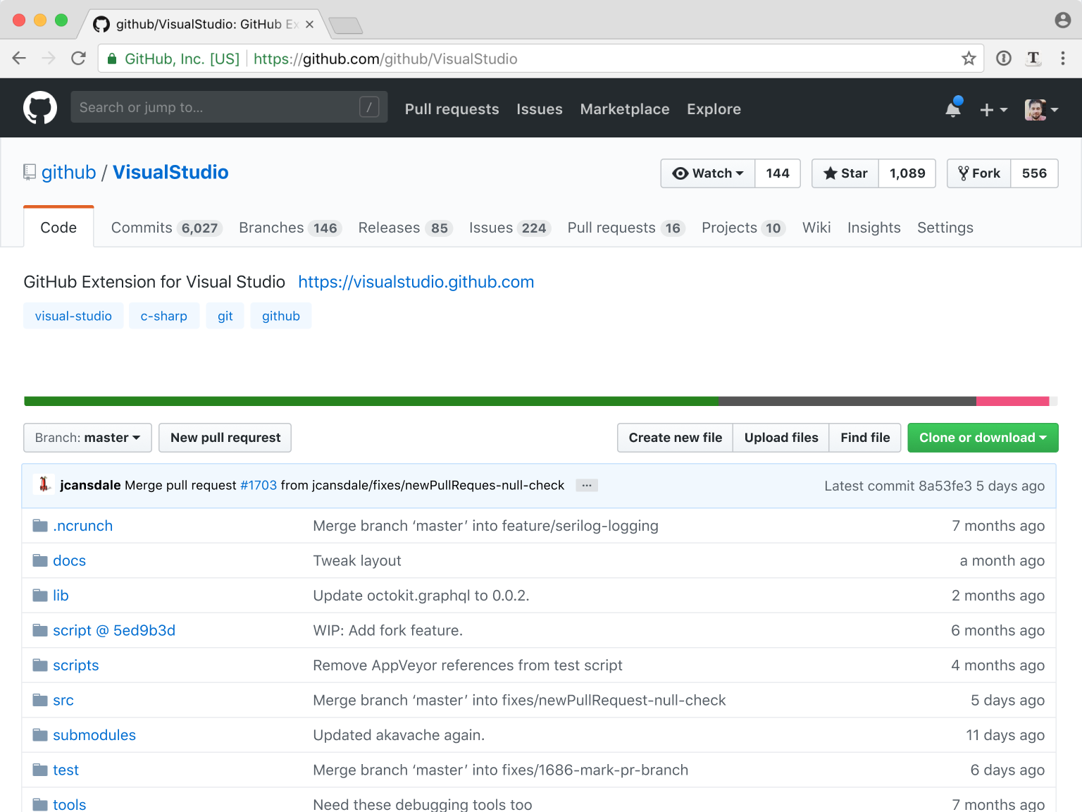
Test yourself, see if you can find Releases tab without an icon and if it was harder than before? It wasn’t, was it?
A note on this design: I am using the same limitations Github already uses: English language only, locked page width of 1020px. For different conditions, say, for the adaptive design we might want a different solution.
Another note: I had to remove Contributors tab (which was actually not a tab, but a sub-tab from Insights that was duplicated in Code for some reason) to accommodate for Settings tab. Don’t worry, we’ll get Contributors back later.
Problem 3: Vanity counters
This is the “vanity menu”:

The thing with vanity metrics is that there should be just one. One metrics is simple to understand and focus. Two or three split attention, making everything weaker.
Luckily for us, both watchers and forks perform poorly as metrics anyways. For watches, people tend not to watch too much. For forks, people tend to fork for no reason.
But stars work. They work because they have no other function but to represent vanity. So let’s keep stars and move them to the left to get more attention:

Problem 4: “Watch” button ambiguity
In the watch button we have a classic “button or status” UX dilemma. Buttons tell us what can be done but don’t say what the current status is. Status tells current state but it’s not clear what it would change to.
In Github case “Watch” has a button label but it doesn’t act as a button: clicking on it won’t make you watch the repo. It’s not a status either: if you see “Watch” it means you are not watching. Same for the other two states: they are neither buttons nor states.

The problem here is that a single button can’t be used to switch between three states. But dropdown can! Dropdowns are a well-established UI component that shows status and can be used to change it at the same time.
Funny, but Github is already using a dropdown! We just need to fix it to work as any other dropdown on Earth works: to show current status. Trivial fix, really:
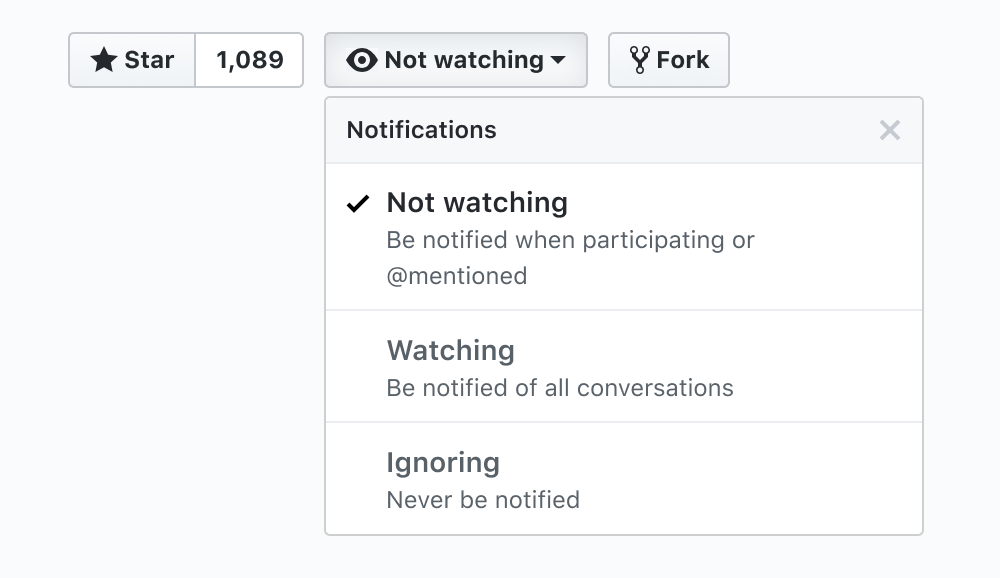
Minor, but annoying: that checkmark is really hard to spot. Let’s highlight the whole row:
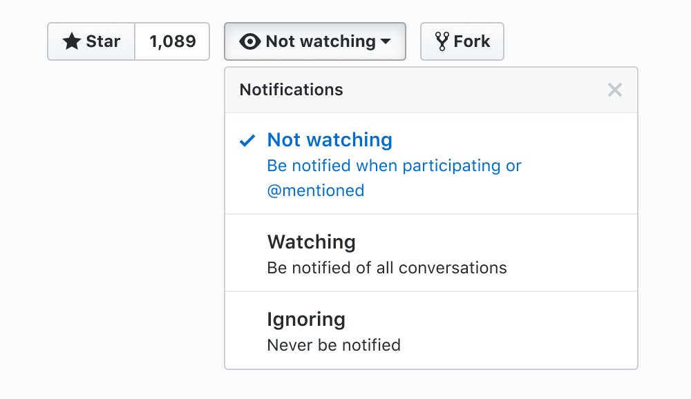
All together so far:
Uff, we’ve done a lot! If you need a little break, now would be a perfect time for it. Don’t worry, I’ll wait.
Back? Great! Let’s move on.
Problem 5: Repo description
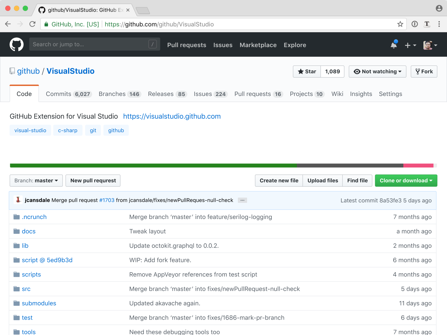
This is the repository description:
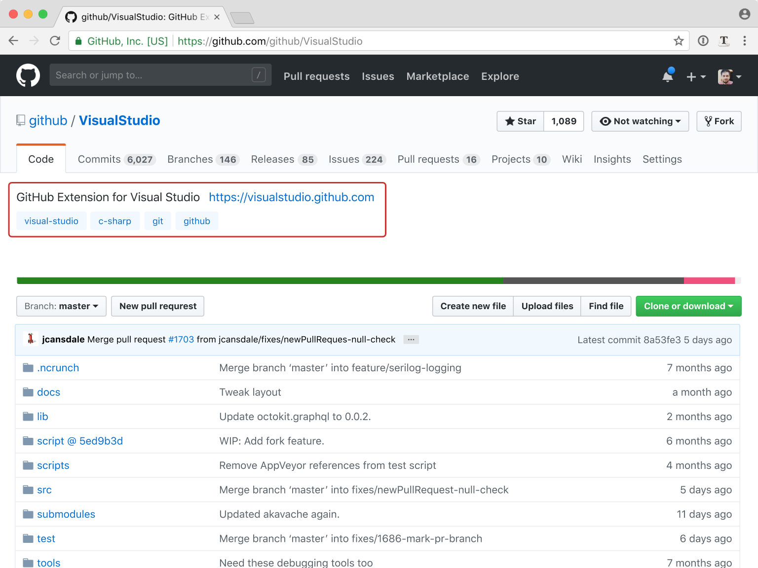
The problem with it is: why is it located under the Code tab? It’s a description of the whole repository, not just its code, right?
To fix this let’s move it above the tabs, to the area that belongs to the whole repository:
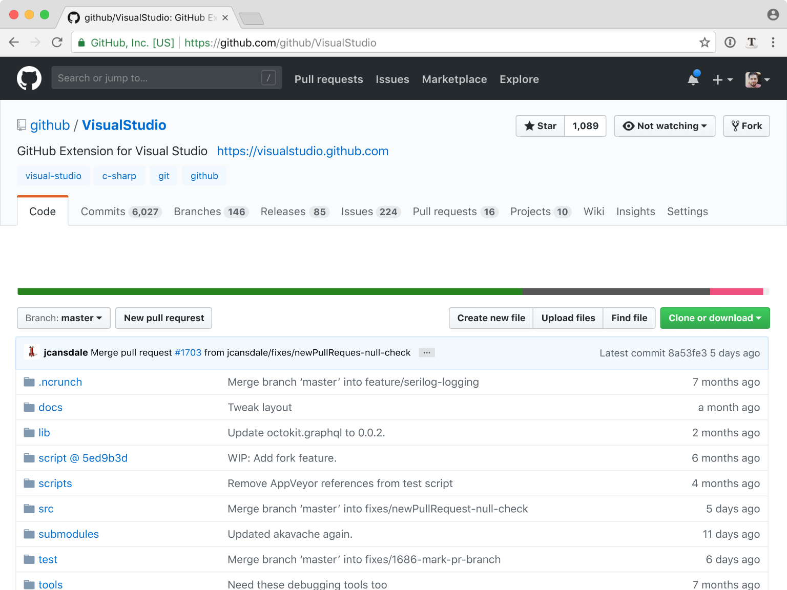
It still needs a couple of touches.
First, font is neither big nor small (it’s 16px, standing between 18px repository name and 14px tabs). Let’s make it 14px so that there’re only two distinct font sizes. Also I’m sure there’s no need to render “https://” in the URL:

The second change is to move topics right next to the repository name. There’re usually just a few of those, so it seems wasteful to dedicate a whole line to them:

Look at us, winning more vertical space again!
Problem 6: Removing background color
Blue topics on blue background became harder to read. This is because they used to be on #FFF and now they’re on Github’s #FAFBFC “very light dirty blue”.
Let’s change tab’s background to #FFF too:

But why was that background there in the first place? What did it do?
My guess is Github had to add it because the structure of their menu layers was becoming too complex and they needed visual cues to help you “split” it in order to understand. The black top bar serves the same purpose: to separate. I mean, they were literally spending a good half of 768px screen at navigation alone.
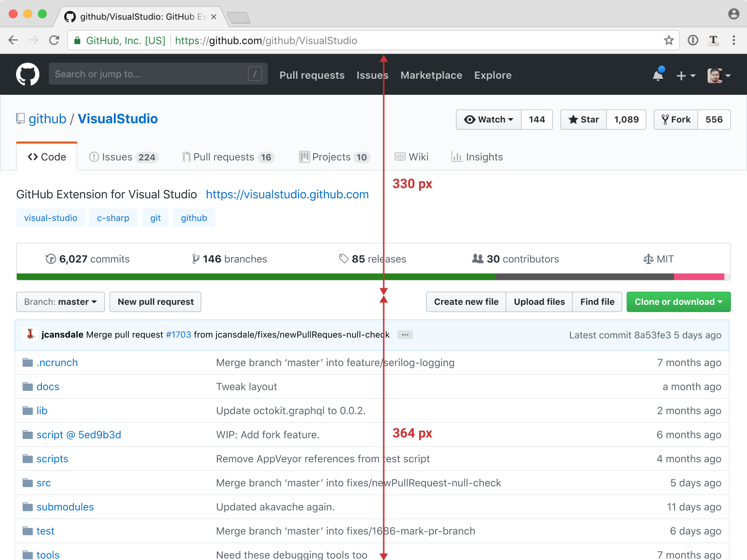
When split into layers, at least you are not immediately scared by it. Without a background, it would be a mess.
But because we simplified the whole header so much and removed one intermediate layer, we don’t need that color coding anymore. Instead, we can enjoy fresh crisp white:
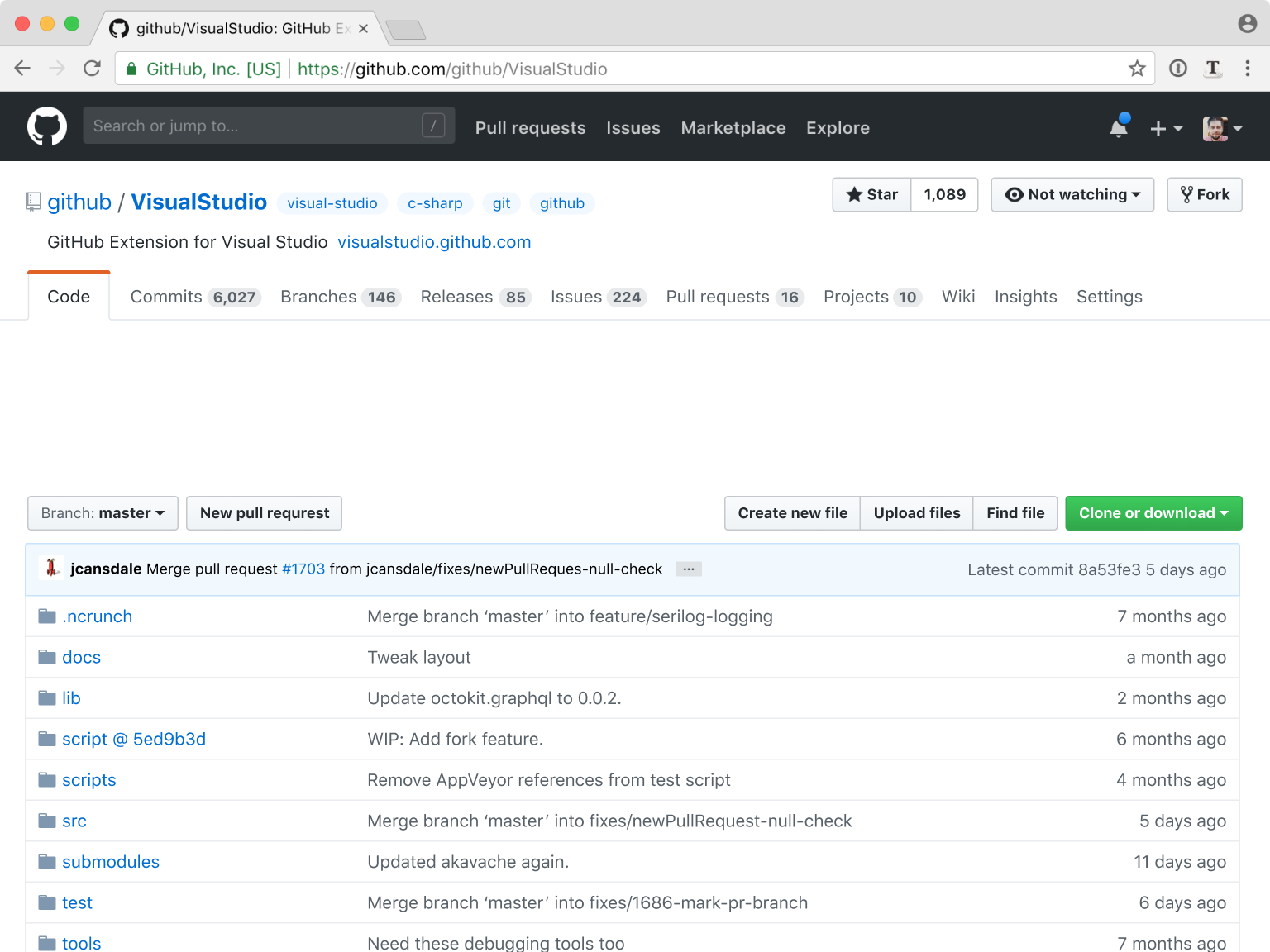
And look at all that free space! Finally, we can see some content in the top half of the screen too.
Problem 7: Description editing
A small touch. If you own the repository, you get to edit both its description and its topics:

First, the “Edit” button is badly misplaced — too far, easy to miss.
Second, separate edit button for topics is an artifact of topics system being developed at a different time, maybe by a different team. There’s really no need to have two separate buttons.
The solution? How many edit buttons do we need? I say none.

“But... Where did edit buttons go?” You might ask.
You see, the nature of description and topics is that it’s important to get people to fill them when they first create their repo. After that, people rarely change them at all.
When there is no description or no topics, we will show a button to add one:

And if description/topics are already filled, go to Settings to change them. Problem solved!
Problem 8: Files description
The traditional Windows File Explorer, together with macOS Finder, have established a simple pattern for file browsing: files on the left, details on the right.
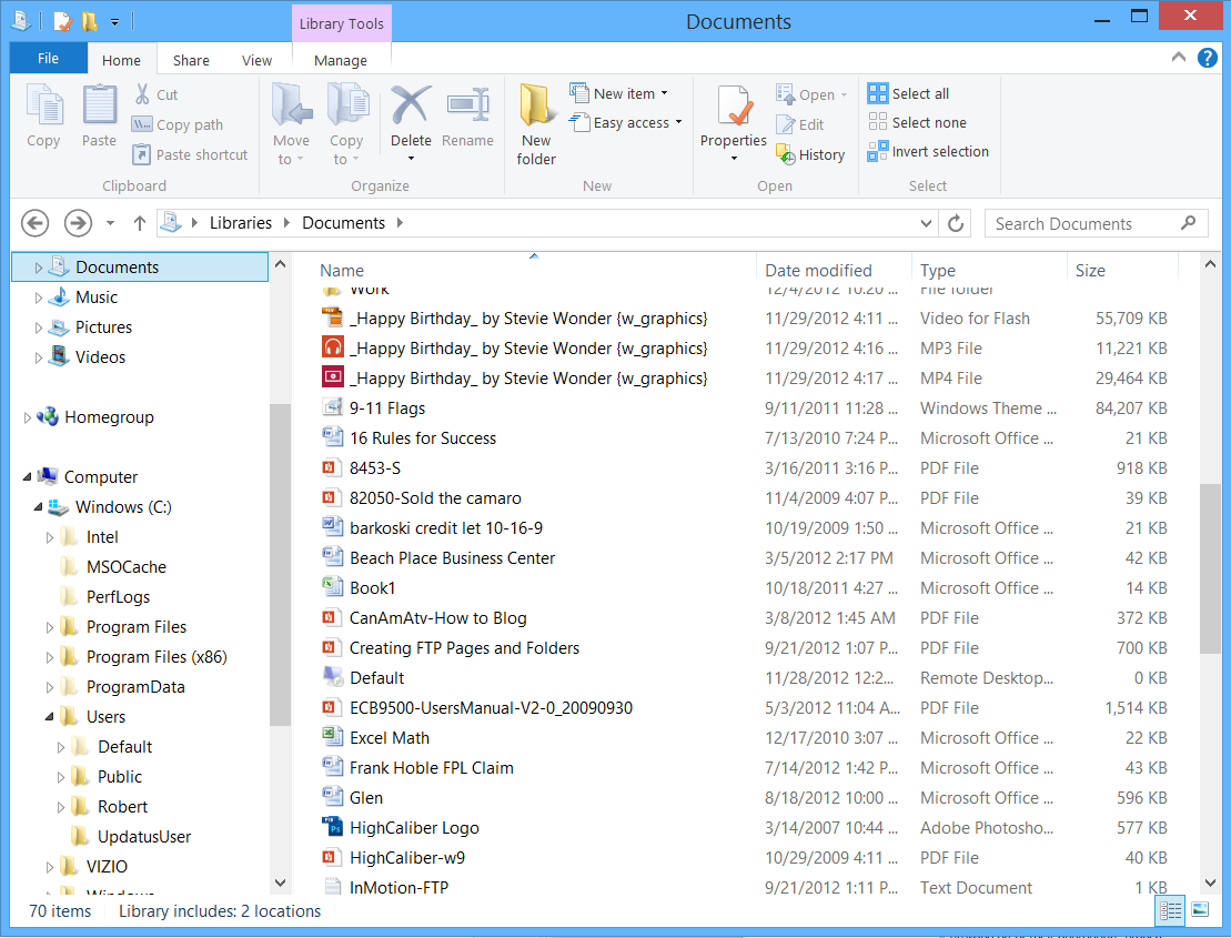
Github decided to copy that pattern, but they put a very unexpected thing as details: a message from the last commit when that particular file was changed.
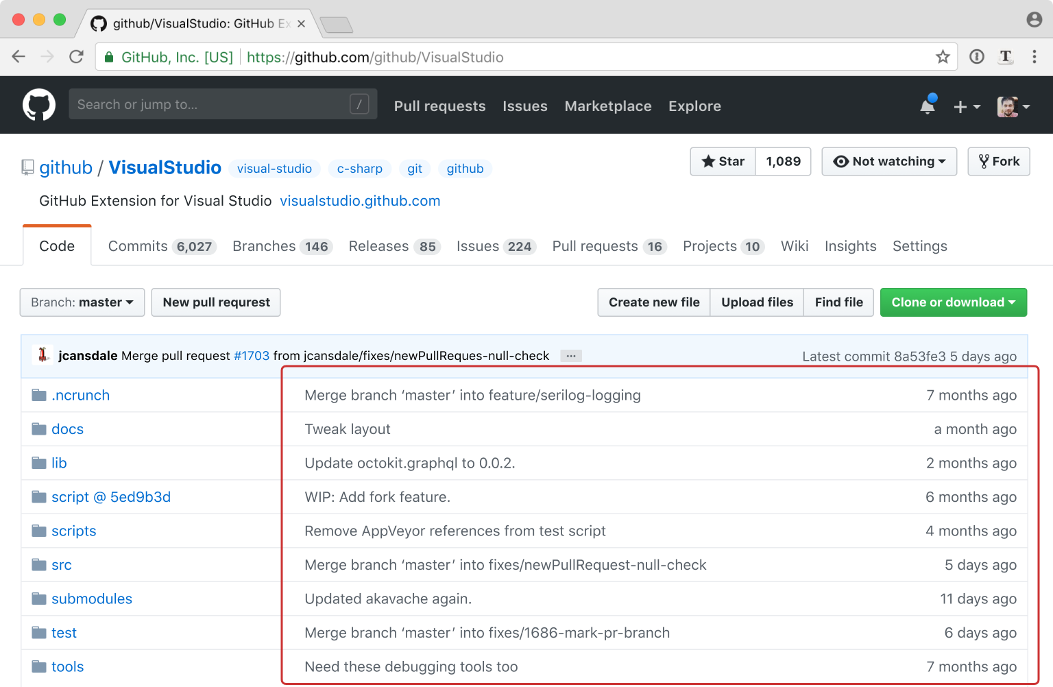
Why? I don’t know. Commits often touch files for completely arbitrary reasons, so the last commit tells you almost nothing. I can’t think of any case when somebody would need that particular information.
Maybe they wanted Github to be “about git” more than about traditional file browsing, and this was the only thing they could think of? That’s my speculation, anyway.
The problem with those details is not that such a huge area is filled with something so rarely useful. The problem is that it looks so much like file description it confuses me every time. “Tweak layout” is not a description of the “Docs” folder. “Need these debug tools too” for “Tools”—why should I care?
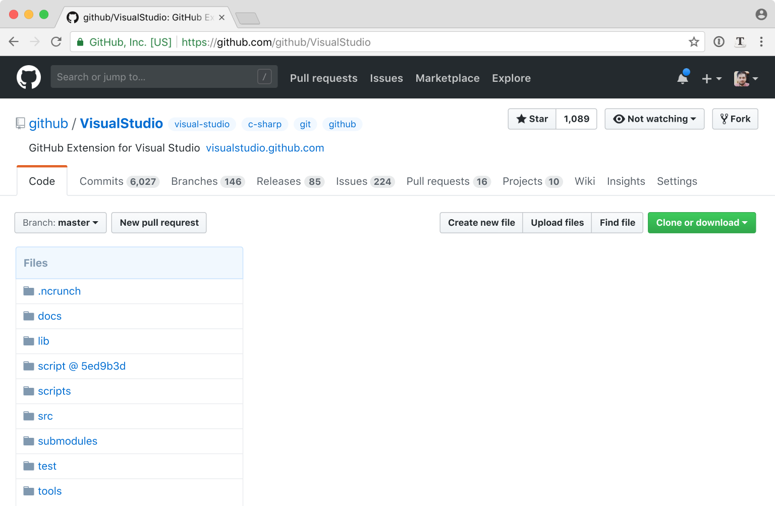
That means we can get rid of the descriptions without really losing anything:
Problem 9: Repository overview
When you get to the repository, the first page you see should not necessarily be Code. We better call it Overview—something to get a quick idea of what’s going on.
Now, the Github repository is more than just a list of files. It’s also about how those files change over time. What new features were added? Which bugs were fixed? Were there any new releases recently? All those are as important as the files themselves.
That’s why I suggest we add a list of recent commits to the Overview page next to files.
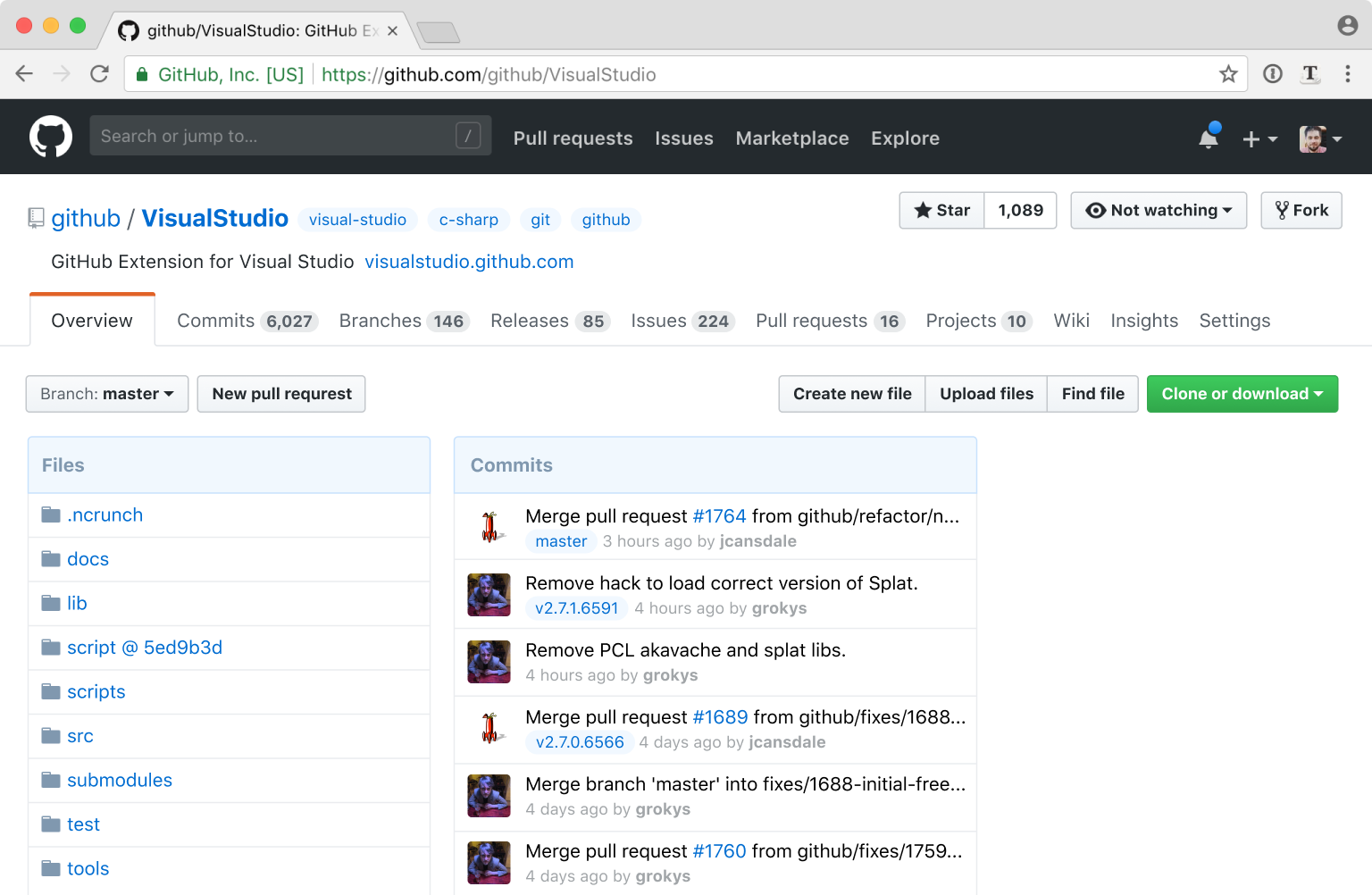
You can now see if a project is actively developed, maintained or abandoned, if an issue you care about was recently fixed, if a new version was recently published etc (notice tags and branches pills in commit list—I miss this feature on Commits tab SO MUCH).
What about that free space on the right? We can put useful stats there:
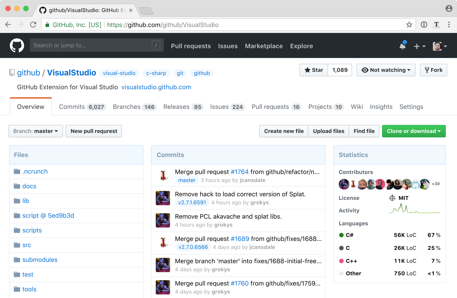
First, I added contributors. Github is all about people and collaboration, that’s why they put so much emphasis on Fork and PR buttons. Well, people are the face of that collaboration. They put their free time and energy to make that code happen. It’s only fair to see some of their faces.
Activity is a relatively new feature that hasn’t found its place on repository page yet—until now. Helps you see how much momentum the project has.
Language statistics was unfairly hidden away, now it’s front and foremost. I also added code size in lines of code — an obvious addition that Github still doesn’t have for some reason.
Altogether, in my opinion, the new Overview tab is more helpful in everyday use.
Problem 10: Contextualizing buttons
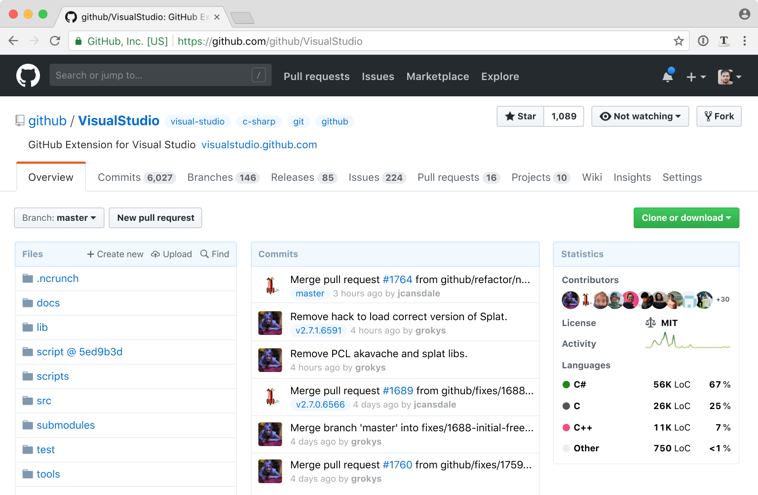
Both “Create new file”, “Upload files” and “Find files” all relate to files, so it will be reasonable to move them right next to the thing they operate on: Files.
Problem 11: Hidden clone link
Github always used to have clone URL directly on a page. That was pretty useful—when you needed to grab the code, no additional clicks were required.
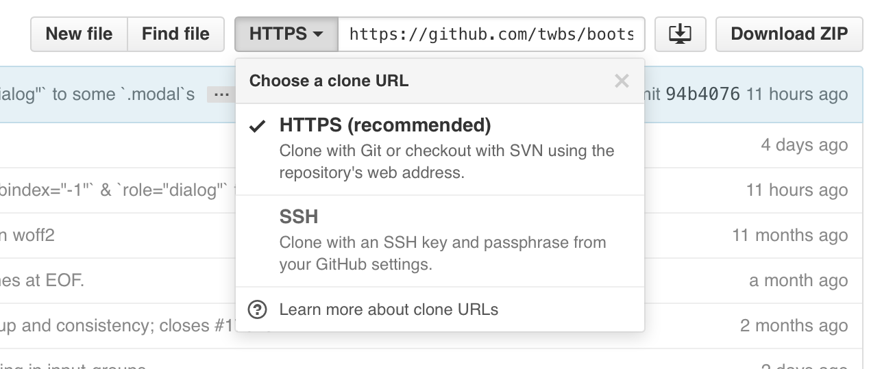
Unfortunately, during one of the redesigns Github hid the clone URL behind a button. My guess is they did it because there was simply not enough space. But people kept looking for it so they had to paint the button green.
Well, after moving file buttons we have enough space to restore full-length Clone link:
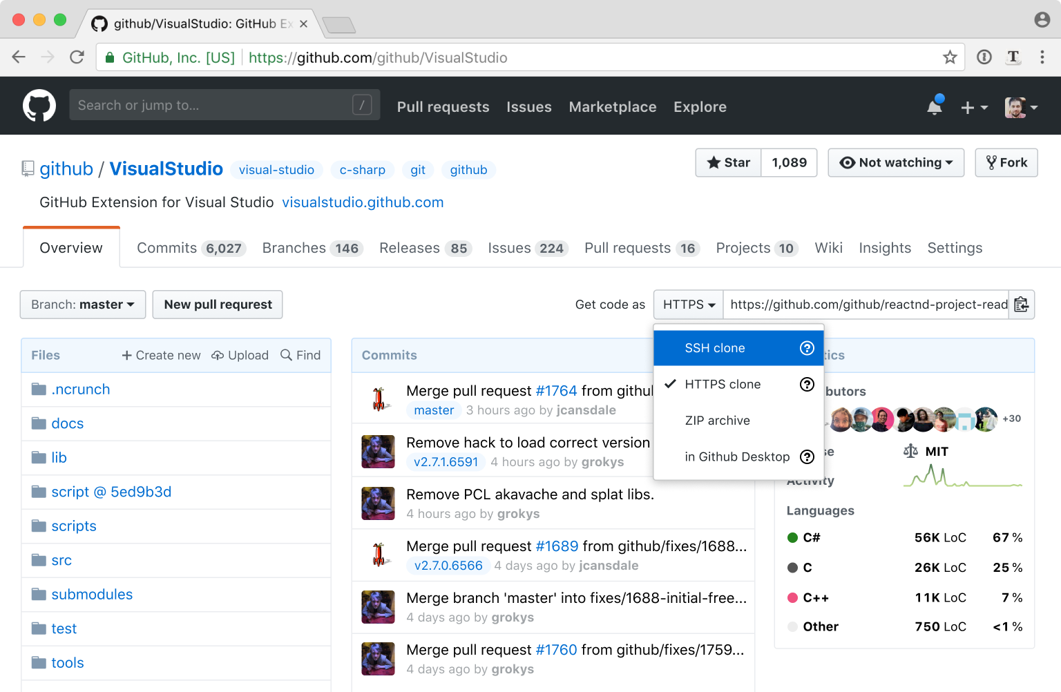
I also unified all four ways to get the repo into a single control, because semantically they are pretty much the same: a way to get the code on your machine.
Last problem: dated look
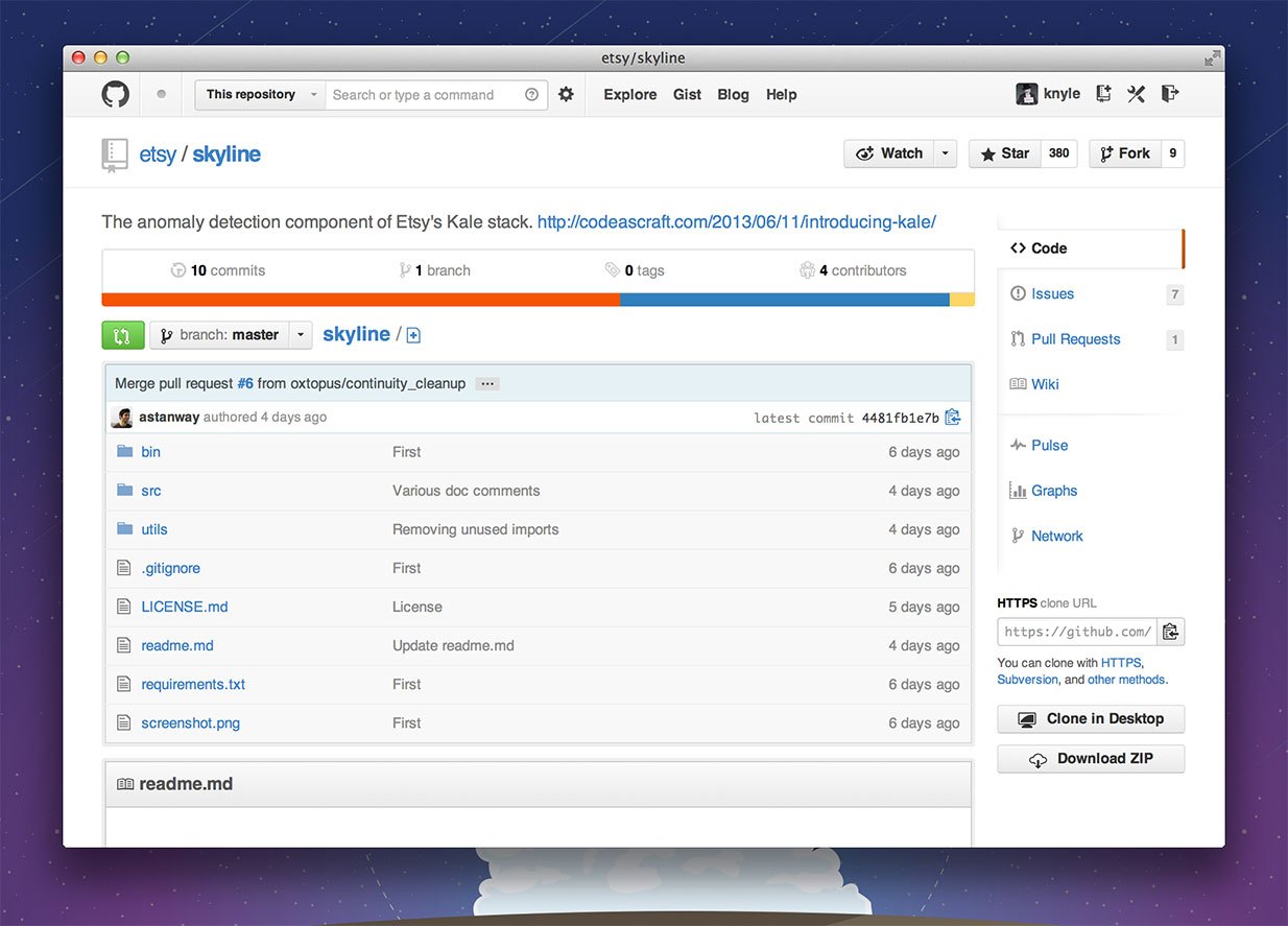
This is how Github used to look back in 2013:
And this is a screenshot from 2015:
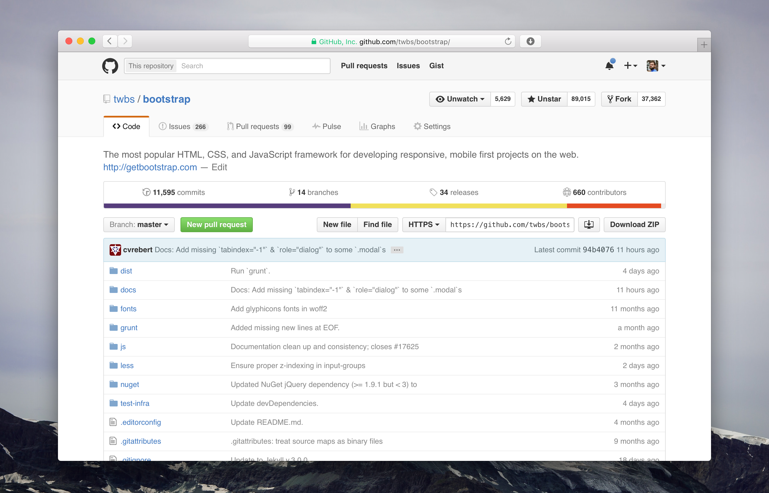
Finally, this is how it looks today:

As you can see, the color scheme and main UI elements haven’t changed much since at least 2013. It’s not necessarily bad and mostly proves that the original design was good enough to stand the test of time.
But maybe it’s time to fresh it up a little? Get rid of gradients, dirty washed-out colors, unnecessary separators, add a little more air. Something like this:
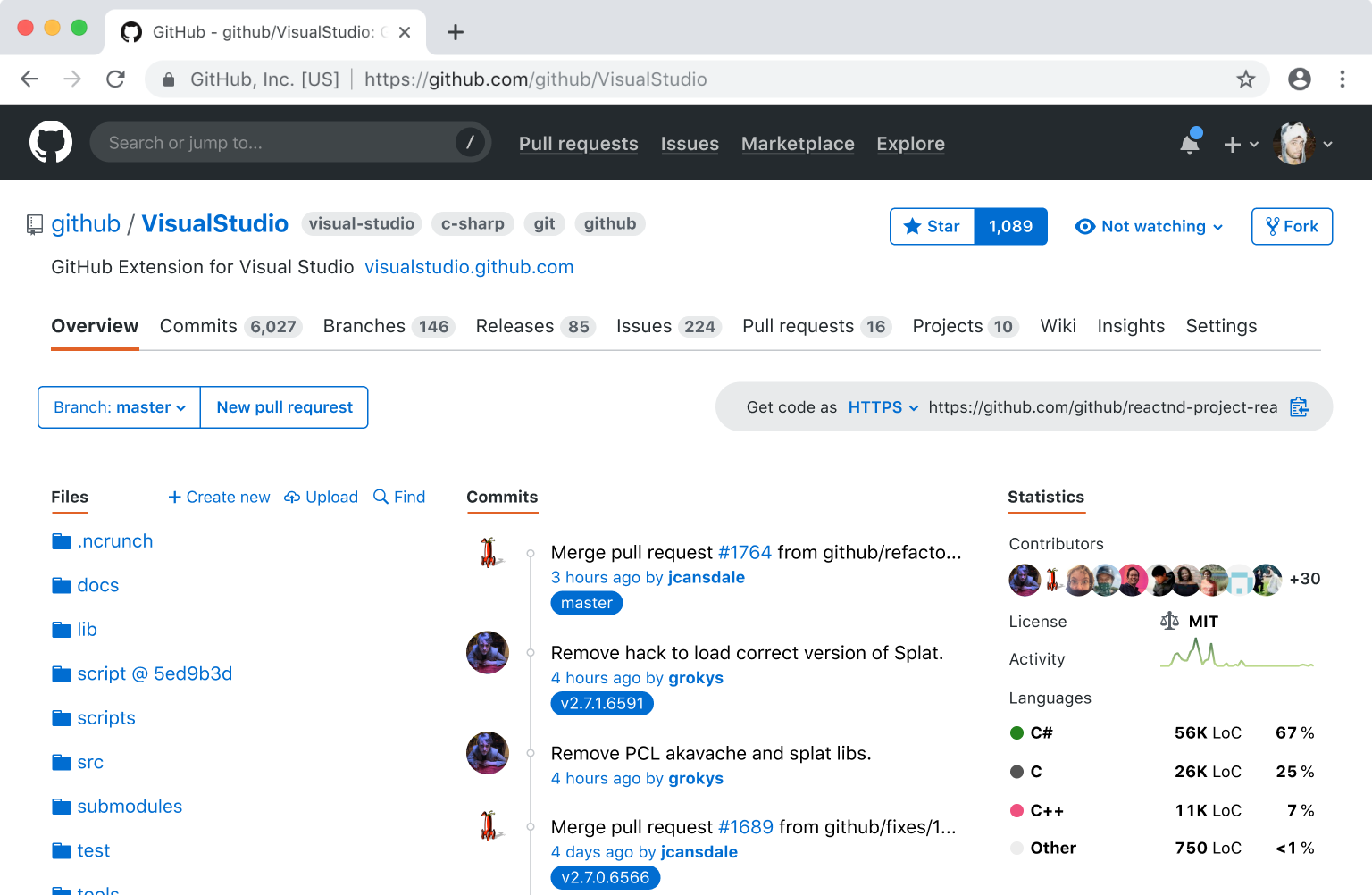
If you feel disoriented, give it a minute. Once you are used to it, you might notice it’s actually easier on the eyes and a bit lighter.
Finally
Current Github design next to my proposal:
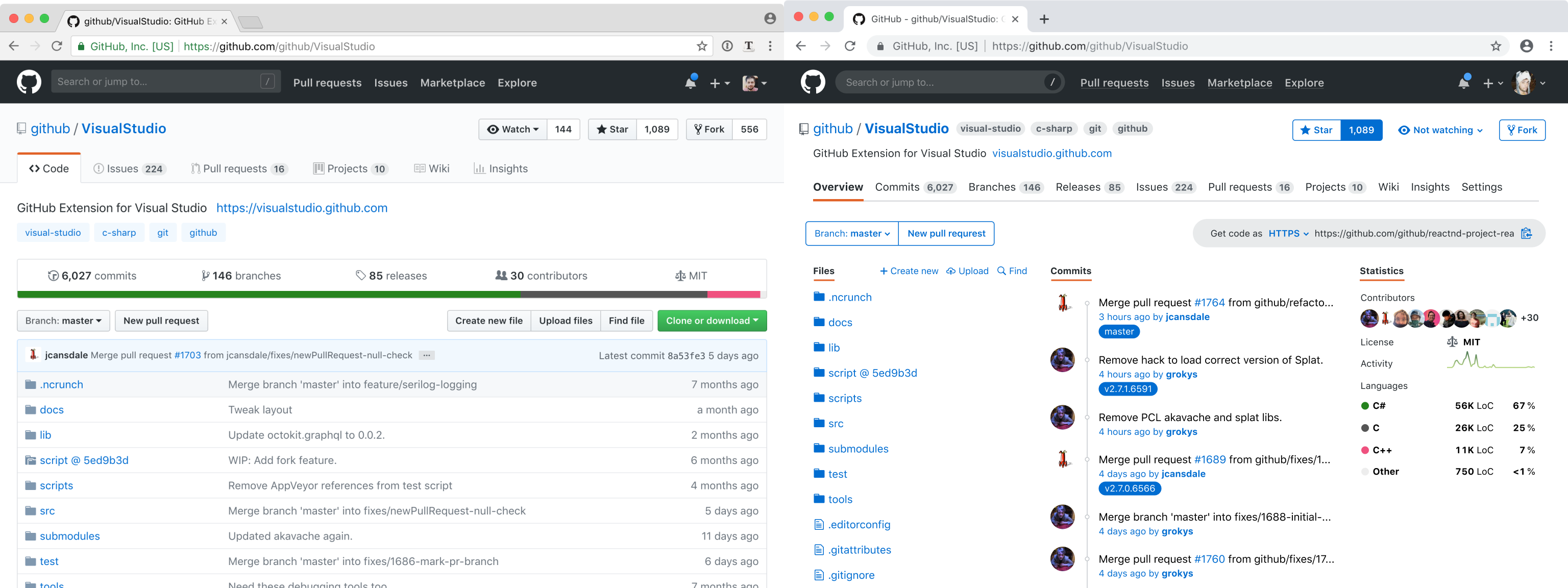
We’ve added ~4 more files to the screen of the same vertical size, 6 last commits, 3 branches, 10 contributors’ faces, project activity AND expanded language stats WITHOUT losing any information.
If you know someone at Github, send them a link to this article. Maybe someone there will like my ideas and eventually get to implement them—who knows?
